Unknown's avatar

Helvetica and Futura walk into a bar

The bartender took a long, hard look at them and said, “Don’t make me get the serif.”

In Spring of 2010 I registered for Typography I. I ignored the requirements (I didn’t have them) and mentally prepared for an introduction to type history, aesthetics and analysis. My motive for taking the class was access to the type shop. A few weeks later I had a formal introduction. I still get faint thinking about it. Of course that could be the fumes.

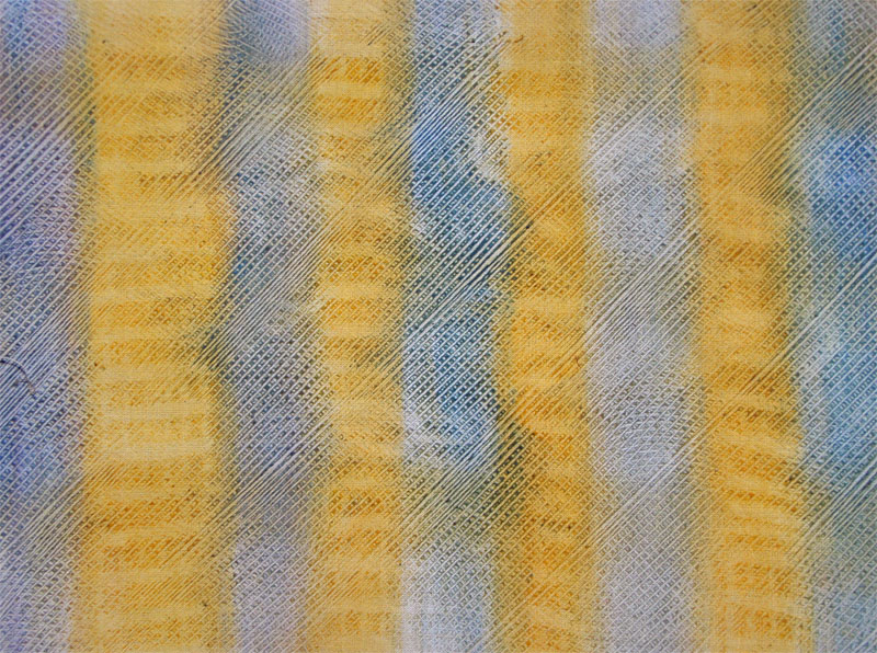
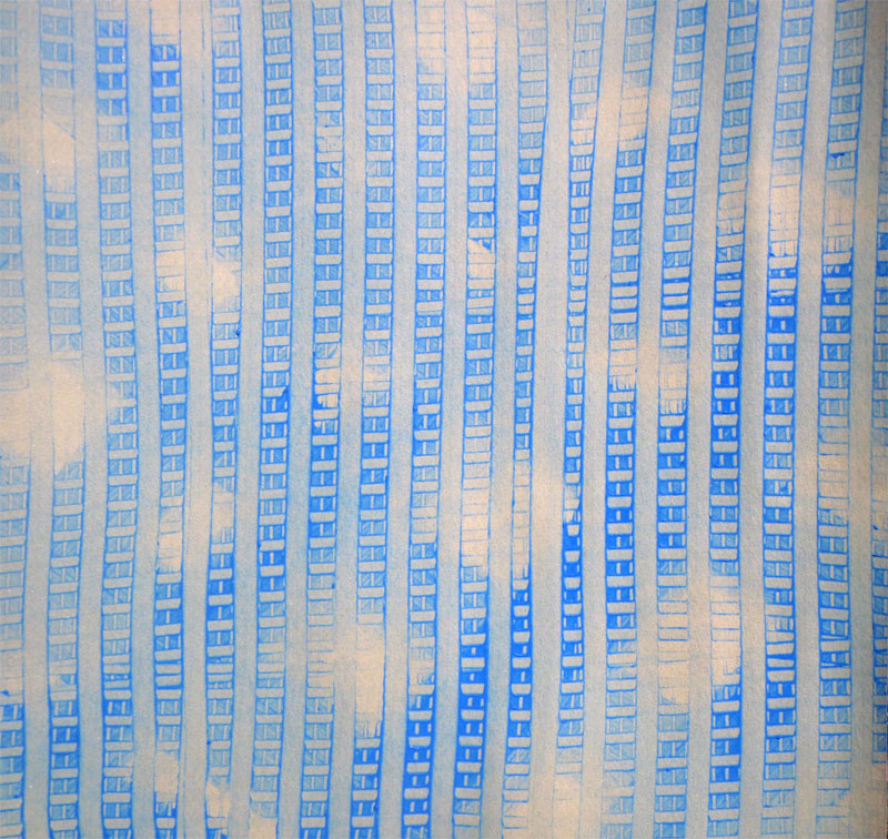
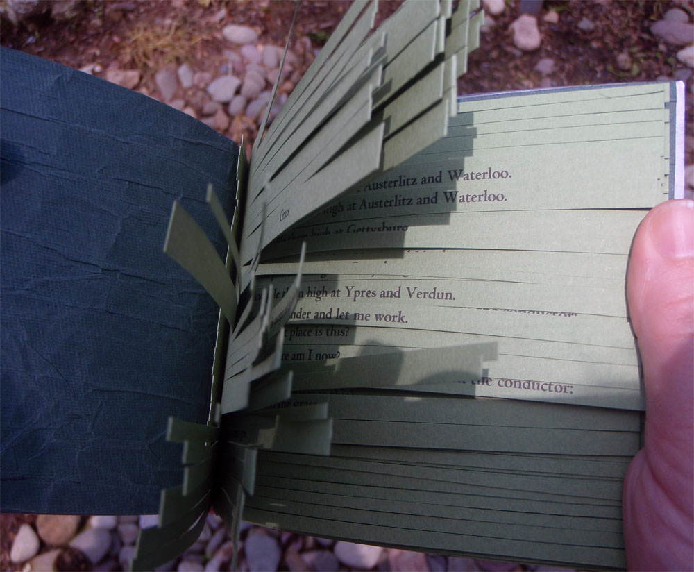
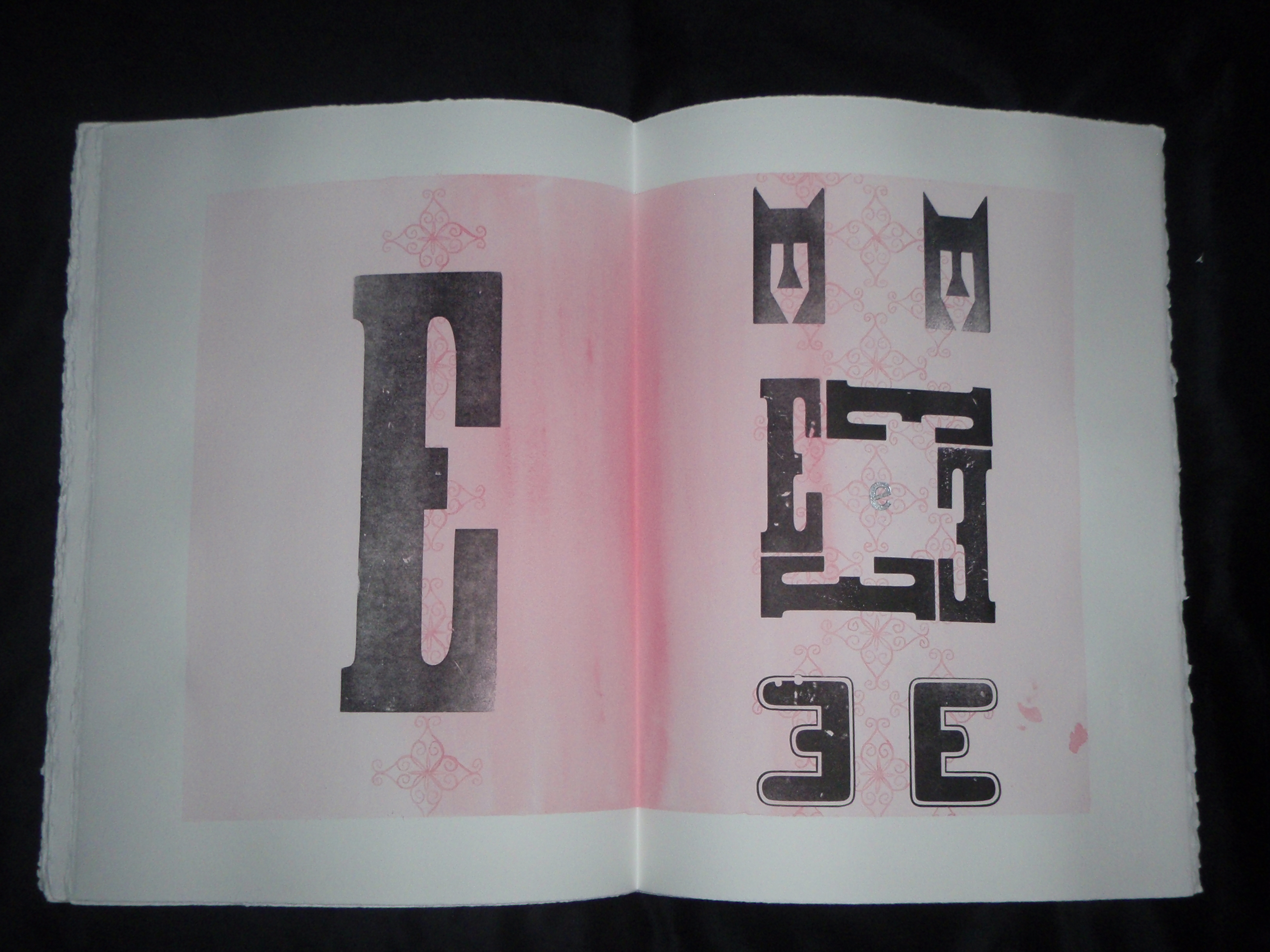
I never had enough time to master typesetting. I still don’t know when too much ink is too much. It takes me forever to register type. I’m a little vague on acceptable imprint depth. But it was so much fun. I only had time to set up one book on the press that semester. It was the result of exploring the many drawers of mismatching wood type.
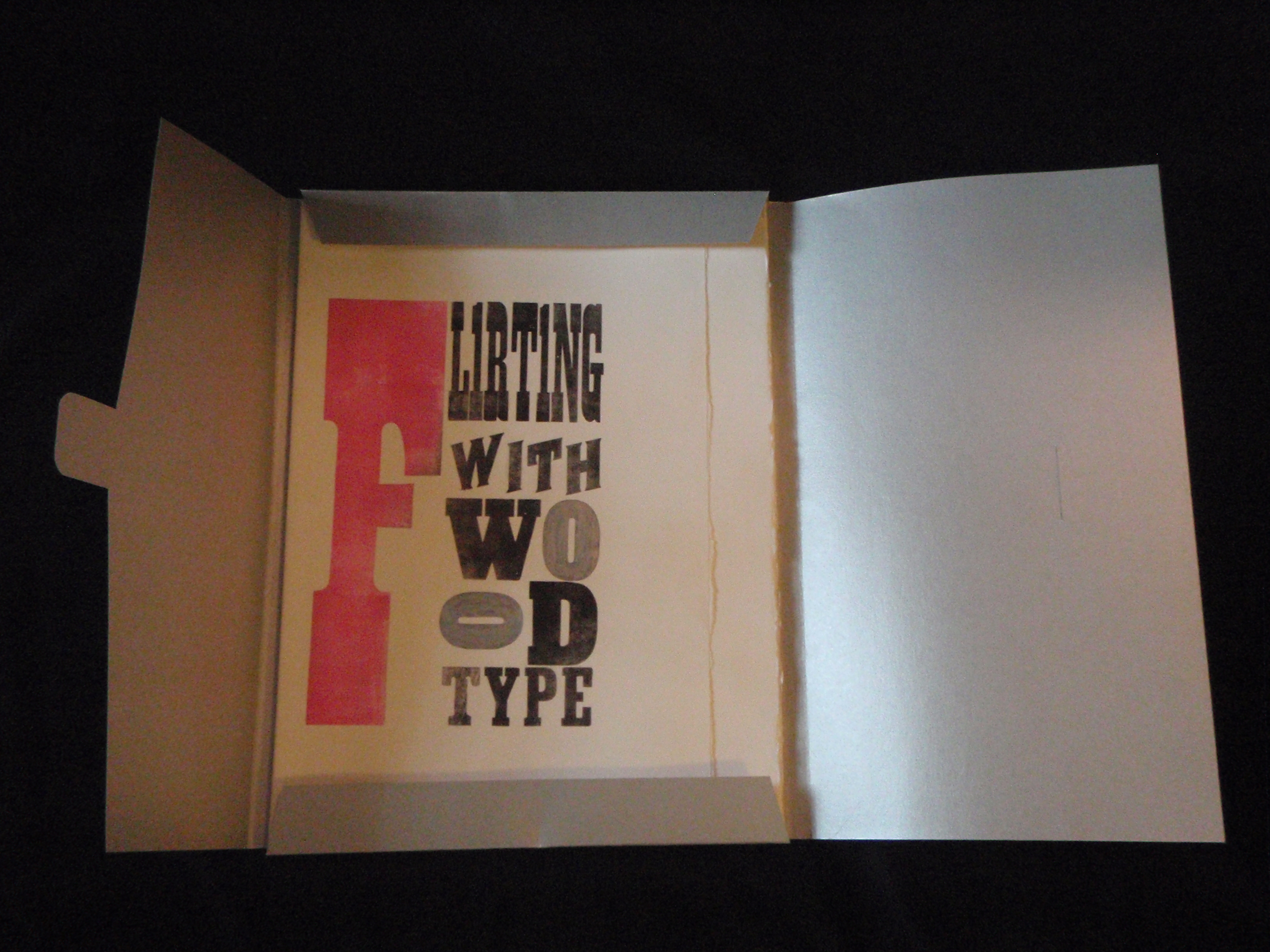
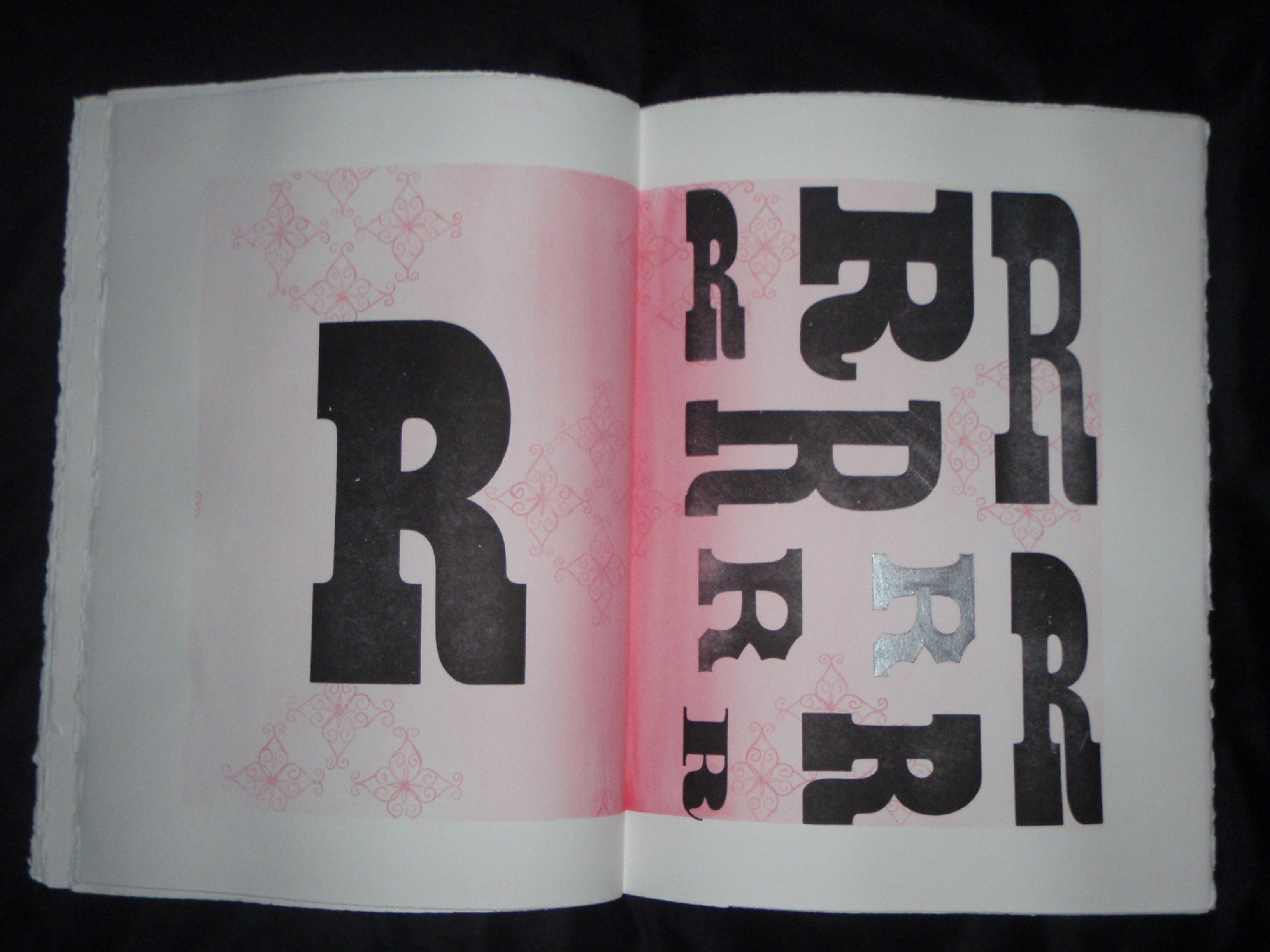
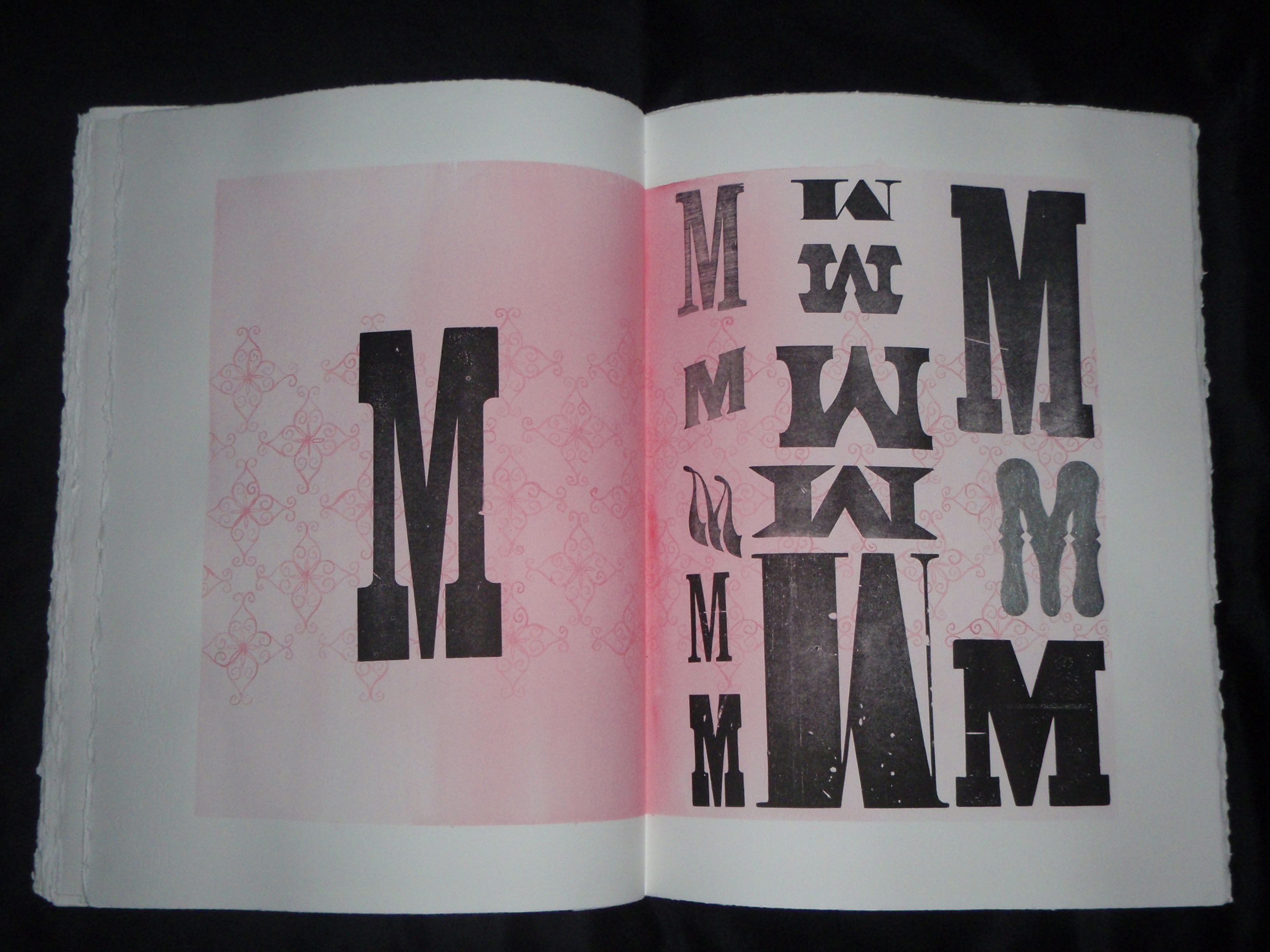
Here is the result:

If anyone knows of a type shop in central Pennsylvania…


Unknown's avatar

(Space) Paste Paper

Not only did I have the opportunity to view a number of artist’s books at the Lilly and Fine Arts Library while I was visiting Bloomington, Indiana, I also made paste papers with Mary of Spring Leaf Press. I can’t wait to make more.

Directions as follows:

Mixture should be a 1(wheat starch):4 (H2O) ratio

In a double boiler, pour a small amount of water into pan and allow to heat up

Pour wheat starch into the measured amount of water and mix until the clumps are gone

Gently pour starch mixture into pan, stir constantly

After 1-2 minutes, the mixture becomes milky and begins to thicken to a pudding-like consistency

Keep stirring for a few more minutes. The mixture becomes glassy and bubbles begin to form

In order to test consistency, place some of the mixture on the back of a spoon and smoosh it against the wall of the pan- it should be stringy

Remove the paste mixture from heat and allow to cool

Wet a mounted screen and pour the now congealed paste mixture onto it

Work paste through the screen. This is the tedious part. The more you work the paste through the screen, the finer the consistency becomes

Massage paste with a paintbrush and add water until it reaches the desired consistency (make sure water is absorbed into paste before adding more water)

Add desired colors to paste mixture

For paper: secure a piece of mylar and place paper on it (for easy clean up). Dampen paper with a sponge, or spray bottle and begin

For cotton cloth: dampen both sides of cloth. Coat one side with unadulterated paste, flip to the other side and begin. If you use clear paste as the first color, painting other colors over it will result in a ghost image

Some samples:

Unknown's avatar

Barbara did it better

As usual, I’m lagging a bit (you know, a month, or two behind) on my projects and posts.

I completed Space Paste/Spring Leaf  project #5 for May. There was only one stipulation for the month: ephemera.

I have a small collecting problem when it comes to natural objects. Feathers, stones, twigs… they all end up in my pocket. This seemed like a perfect opportunity to reduce the piles of snail shells and seed pods cluttering my living space. With the help of a friend, I turned a warped job case into two curiosity cabinets. I placed a transient treasure in each compartment. Except one- in that compartment sits a small book filled with abstracted watercolor and ink drawings.

I was pleased with my creation. Until I visited the Lilly Library in July and got my hands on (thanks, Jim!) Wunder Cabinet by Barbara Hodgeson and Rollin Milroy. And may I just say, squeal! Inspired by the wunderkammern of Germany, these two constructed a beautifully crafted two-layered box containing an assortment of flora, fauna and oddities. Each piece is cataloged with curatorial diligence and corresponds with one of three books (paper made by Reg Lissel) included in the package. It was a delight to sort through each compartment and discover the keepsakes waiting for me.

Thanks, Barbara, for showing me how it’s done.

Unknown's avatar

Valley of the doll

Often, when I begin a project I have (mislaid) hopes that it will be pretty. Instead it turns out… wrong. Not in a sense of craftsmanship, or intention, but in a sense of that ain’t right. Mostly, I’m okay with that and occasionally I turn out an elegantsugarpuppy. This isn’t one of those.

Her name is Heidi Hydra, aptly named by her new keeper. I’ve been intrigued by art toys for some time and, more recently, plush dolls. Heidi is the second of what was going to be a series, but I was distracted by other projects (Images of the first can be found here).

Heidi is around twenty-four inches tall, hand-dyed (fiber reactive) and hand and machine sewn from what was once a favorite linen skirt. My friend, Karen B., was kind enough to create her bustier and skirt (also from a pre-existing garment). Heidi has a small pocket over her heart and another where her head should be. I like to think of that one as a retractable stomach, like those of some echinoderms–  I know, every doll should have one.

Unknown's avatar

The Grass is Green

Two posts within forty-eight hours! I win!

I finished April’s desperately overdue book activity a few days ago. The rules of engagement were: wax poetic and use a non adhesive binding. Choosing the text for this project made me crazy! Initially I wanted to use the poetry of a friend, but he wasn’t thrilled about others reading the musings of his early twenties. Then, I found some limericks written by my grandfather, but they didn’t seem appropriate. As I vacantly stared into the yard, bemoaning my lack of poetry, I noticed the grass, green and out of control. Ha! I went to the interwebs and found a poem related to grass. Carl Sandburg’s Grass (represented here with improper spacing. Apologies):

Pile the bodies high at Austerlitz and Waterloo.

Shovel them under and let me work–

I am the grass; I cover all.

And pile them high at Gettysburg

And pile them high at Ypres and Verdun.

Shovel them under and let me work.

Two years, ten years, and the passengers ask the conductor:

What place is this?

Where am I now?

I am the grass.

Let me work.

Gettysburg is all grass now. A visitor would never know that 7,000 soldiers died there and over 50,000 suffered casualties. I find the words somber, yet comforting.

I printed the poem on Murano paper and shredded it to be reminiscent of grass. The covers are recycled printing plates from a former project, sanded and distressed. The book is held together with a stab binding. I was hoping for a balance between manufactured and organic- the machine of war and the patience of the natural world. It lacks subtlety, but that’s what comes from playing catch-up.

Unknown's avatar

Lost & Found

If my blog were a puppy, PETA would have locked me up!

I finally found time to take photos of March’s project with Spring Leaf Press. The theme was Things In a Box. I illustrated nine objects I lost during a particularly stressful school semester and pocketed them in a concertina book. The back of each object states what it was and where I lost it (and in some marvelous cases, where I found it).

I was pleased with the way the collage of illustrations and scanned imagery developed. However, I wasn’t entirely chipper about the outcome of this project. Most mistakes were due to human error (impatience!). I failed to get a crisp fold with Murano paper and the bottom half of the book is too heavy. Both miscalculations resulted in spine warpage.  And no matter how many times I cut and glue a cover, there’s always something! Something, in this case, being cockeyed placement. Grrrowl!

Unknown's avatar

Exercise II: Push!

In the beginning of the year, my friend Mary at Spring Leaf Press and I decided to work on book exercises in order to improve and maintain our hand skills, inspire creativity and learn new techniques. At the beginning of each month we decide on our guidelines, which typically include a theme, a format and a time frame. The rules for February were as follows: teach or preach, zine, 7&7 (7 days to ideate and 7 days to execute). Additionally, the zine could include a found object and hand applied color.

I didn’t research this one. I went with my gut- 1970s punk rock cut and paste appropriated images with poor visibility. Since I was going with my gut, I chose the digestive system, its parts, functions and malfunctions, as my theme. I used images from the ground (one found object!), a lip-print and a current professional project I am working on. With the help of Photoshop, a marker and a copying machine I produced  a double sided four page spread that takes you on a mouth to ass journey through the GI tract. If you have the patience to wade through the copious and disordered writing.

Unknown's avatar

Context

Preparing for a presence on the interwebs has resulted in a liberal amount of amateur picture taking on my part. I’ll be the first to admit it’s not where my talents lie, but it sparked my curiosity where context is concerned. How much does background affect the piece of art in focus? Does a dramatic shot take concentration away from the piece, or add to it? If the object isn’t photographed against a solid backdrop, does it lack professionalism? Is it possible to use light, focus and composition to snap a shot that doesn’t influence the viewer?

Or is this creepy any way you look at it?

Unknown's avatar

Welcome to Space Paste Press

Hello there! Welcome to Space Paste Press, one woman’s adventure into the world of artist’s books with overlapping side trips into textiles, print and other art processes.

I created Space Paste Press in 1996 as an informal presence to help organize the cards and books I was making for friends and family. The name stayed with me over the years and now functions as a business/press. I am a native of Pennsylvania, where I earned an A.S. in funeral service education (I know, a funny choice). Although I never pursued it as a profession, it improved my understanding of anatomical and biological processes, which have consistently appeared in my work over the years. I later graduated from Indiana University with a B.A. in studio art, where I also studied conservation of material culture and fashion design. While attending classes, I registered for an advanced graphic design seminar and was introduced to, and became enamored with the artist’s book. That led to a fortuitous position as a conservation assistant at the Lilly Library, which houses a world-renowned collection of manuscripts, puzzles, sheet music and ephemera (now every time I create, I think about inherent vice).

The artist’s book is a contemporary art genre in which the book functions as an art object in order to communicate an idea, or concept. Due to the format, the viewer/reader becomes an active participant in the piece, creating an intimate interaction between art and audience. Is that too much? Okay, the artist’s book engages the senses; you hear the pages turn because you turn them, you feel the texture of the paper under your fingers, you can smell the ink, you see the imagery and read the text, and you can often fit them in your pocket! I love it! Artist’s books allow for an inexhaustible range of mediums, content, structure and collaboration.

If you would like more information, an interesting and approachable essay about the definition of the artist’s book by Angela Lorenz can be found at angelalorenzartistsbooks.

I hope you enjoy it here,

Kristin