Topographia

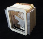
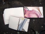
Who doesn’t love a little geography? Topographia began as a project with Spring Leaf Press some time ago and gradually eroded. It resurfaced as I was going through the unfinished project pile. I struggled with choosing to complete it versus tossing the whole thing in the trash. I decided to keep the pages, but didn’t know how to finish them.

I moved one step closer to making an actual book by reinforcing the card stock pages with book cloth and sewing the text signatures onto tapes. I did it twice, because the initial thread I used wasn’t strong enough.

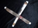
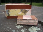
The book languished for another three months before I tackled it, largely because I wanted to participate in a rapidly approaching exhibit. When I first began the project, I imagined a three dimensional cover that represented a raised map, and I decided to run with that. I used book board as a base and paper mache to sculpt ridges and valleys. I cut slits in the book board beforehand to allow for the tapes to be threaded through it. Because I procrastinated, I needed my covers to dry quickly, so I popped them in the oven at 250 degrees. This decreased the drying time, but increased the warping. I put weights on the covers as they came out of the oven to help maintain flatness.

Next, I used acrylic paint to help the landscape along. Once it was dry, I threaded and glued in the tapes, leaving them exposed on the inside cover.

The end result reminds me a lot of a fifth grade diorama; rough, but full of charm.

I got it to the exhibit on time and displayed it with a few of my other artist’s books in June of 2017 (yipes!). There was great opening night participation, and it also turned out to be an interesting exercise in encouraging viewers to touch the art.

When I learned I was leaving for the left coast, I packed it up with other art paraphernalia and brought it along. It recently made another appearance at Hidden Villa’s Homesteading Day, where it mostly delighted kids of varying ages.

Maybe there’s some truth to the diorama.

April

We all can use a little inspiration now and then. All those creative ideas ricocheting around in our heads can make it difficult to just choose one. Sometimes, we can’t overcome the entropy that has temporarily taken over our thought process. Occasionally, deliberating for even a few minutes, about whether or not to put some beauty in the world, feels like a herculean task. April was a project taken on to encourage daily handwork and creativity in my routine and to bring a little unexpected delight to the people I care about.

Each day for the month of April 2016, I made a small piece of art measuring 2 x 3 inches. They varied in complexity and included drawings, a stencil, a stamp, sayings, handmade paper, a recipe, dried flowers, miniature books and paintings. Materials included wax, paper, watercolor, drawing fluid, ink, colored pencil, crayon, hand dyed fabric, paste cloth, polymer clay, seeds and photographs. I made three versions; each individualized for it’s intended recipient (all creative people with limited time and so much going on in their lives).

I put all the cards, willy nilly, in an altered cigar box. I thought about maintaining more order with the pieces, but in the end, the joy of discovery, and sorting through unknown treasures, exceeded my need for structure.

It is my hope that when my people are in want of creative stimulation, they can pull this box off the shelf, sift through its contents, and kick-start a brainstorm of their own.

It so happens that one friend has re purposed the project to entertain her almost two year old. Most of the cards now live in a wallet that travels with them. When he get impatient, the wallet comes out and he plays with the cards. How’s that for creative reuse?

Cool Shirt

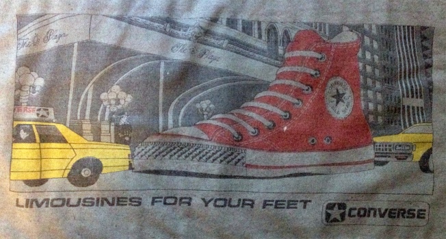
I love graphic t-shirts. I don’t wear a lot of them anymore, but I did when I was in my teens and twenties. My favorite was a shirt I ordered from Mad Magazine with many incarnations of Alfred E. Newman printed on it. I remember a long sleeved black t with a vampire sleeping in her coffin, purchased at a New Jersey horror convention. I got a lot of wear out of a vintage converse shirt I found thrifting. The t-shirt is long gone, but I cut out the graphic because I couldn’t bear to part with it.

Which leads me to this post. I don’t think of myself as sentimental, but I hate to throw out a good print. It does not seem prudent to hold on to unwearable t-shirts. How often are you going to look at them? Where are you going to put them? And yet, I find myself keeping them anyway.

I finally found a solution. I turn them into book cloth (a subject for another day). It gives me the opportunity to appreciate the graphic one more time  and create one of a kind books for others to enjoy.

I can also tell you where they all came from, in case anyone wants a story with their book. The jackalopes were a memento of a free burlesque show hosted by Indiana University. The show ended with a sparkler in a queen’s behind. Very patriotic.  Everything is fine and the bananas came from the Northern Sun catalog. The koi was from my father- something he picked up at a pond trade show. The glowing red eye is part of a Sepultura (or within same genre) shirt that belonged to an ex. Sheep Unite? Something I screen printed in high school. There were Dead Kennedys lyrics on the back. I am not sure where the dino came from, but I do remember I wore it with duct tape (solid fashion choice) in high school.

Thanks for indulging me.

limos

Save

Eat Your Vegetables

This book is untitled and was spawned from an ongoing Space Paste and Spring Leaf Press collaboration beginning in 2012. This exercise is from March to August of 2014 and the parameters included a miniature book constructed in a day using materials immediately available in the studio. I managed to successfully adhere to two out of the three and I’m good with that.

The book depicts the contents of my csa share  from GroundWork Farms for August 6, 2014. I used watercolor for the vegetable images. A piece of my favorite (but broken) hat, a hemp shoe string and a paste cloth spine became the cover. Other materials included Rives BFK (so predictable- who doesn’t have this in their studio?), archival ink and linen thread.

It was a fun exercise. I had a chance to play around with a material I don’t normally use- hat- and it was successful in creating a farmy feel. I also had an opportunity to incorporate my vegetable images into another venue. They are being used this September as a marketing tool for the  Duveneck Dinner, a fundraising event held by Hidden Villa, a nonprofit educational farm that provides a structure for learning about the environment and social justice in Los Altos Hills, California. Cool, yeah?


This Dream Intentionally Left Blank

In June to August of 2015 I participated in the Ideation Experience exhibit at The Abecedarian Gallery. The project was based on the Ideation Deck by Barbara Tetenbaum and Julie Chen. Within the deck are Category and Adjective cards representing aspects of design and bookmaking structure. The deck acts as a catalyst in the creative process. The player of this game picks twelve cards-seven in Category and five in Adjective- and that determines the technical attitude of the book. It does not however, create the theme.

In the category deck I blindly drew abstract (image), hand drawn/painted (technique), stream of consciousness/free write/rant (text), pre-treated (paper), grid (layout), highly colorful (color) and innovative (structure). Adjectives included poetic, soft, textured, whimsical and impressionistic.

I wasn’t sure how to make it work. The only way I thought I could incorporate all of my cards was to draw from the subconscious (but not my subconscious, ahem) and use the fears, desires, epiphanies and general absurdities that come from dreaming. In the end, I had a box that housed five dice and unfolded into a circle when opened.

I imagine there could be a lot of dialogue over whether or not a folded box is innovative, but there it is. The paper was pre-treated with a water color wash in light colors (soft, impressionistic), illustrated with dream imagery (whimsical, hand painted) and then over painted with a broken grid.

I used an awl to punch holes along the grid lines. I used gold pigment and sandpaper to create pattern and texture.

The dice are numbered. When rolled and put together in numerical order they form a sentence that can hopefully be interpreted as poetic and following a stream of consciousness. There are 7776 possible sentence combinations. The chances of rolling the original sentences are slim to none.

They are as follows (in case you were wondering):

1. Winged nightmare threatens vulnerable eyeballs

2. Pornographic lagomorph enthralls into orgasm

3. Living tree reaches throughout existence

4. Impassioned lover acquiesces individual consciousness

5. Perceived labyrinth confuses existential reality

6. (The wild card and resulting title of this piece) This dream intentionally left blank

I promise, the more you roll, the more ridiculous it gets.


Winged dream acquiesces into reality

Impassioned nightmare confuses existential blank

This labyrinth threatens individual existence

(I think I might be ready for open mic night)

Incidentally, I made a small book with the scraps of this project. The pages are contained in a wrap around cover. There is no text, only abstraction, color and a little bit of thread. I am surprisingly pleased with the results. Perceived dream enthralls throughout existence!


Destroying Angel

I’ve been a little obsessed with fungus lately. It’s because of the rain. All sorts of varieties are showing up- Turkey Tail, Chicken of the Woods, jellies and corals. Some are edible, some, not so much. For example, the Destroying Angel is one of the most toxic mushrooms in North America. Once eaten, flu-like symptoms develop within 4 to 12 hours. After a period of sickness, the symptoms disappear for approximately 24 hours. If the signs of amatoxin poisoning are not recognized in time, the liver shuts down followed by a hepatic coma. Most people never wake up. Don’t eat it!

Anyway, mushrooms, specifically, the Destroying Angel, was my focus for September’s collaborative Space Paste/Spring Leaf exercise. There were two controls, a scroll format and science.

The body of my scroll is hand-dyed cotton. The pattern is a result of paste resist. The imagery consists computer generated iron on transfers (the science!), thread drawings and fabricated journal entries about a father-son hiking trip gone wrong.

If you would like to read an account of someone who survived ingesting the Destroying Angel, check out Richard Eshelmans’ post on the Cornell Mushroom Blog.

Tea, anyone?

I love a well brewed cup of tea. I hold the warm mug in my hands, watch the steam curl into the ether and mentally go over my to-do list. Which brings me to my incredibly delinquent June collaborative project with Spring Leaf Press.

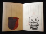
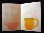
If memory recalls (it was four months ago. Yipes!), there was only one rule of engagement; a record of time passing. I graphed my tea consumption over the course of a week. I initially imagined this exercise on a heavy weight paper with mug screen prints placed solidly on top of one transparent chart, all folded neatly into a concertina format. Due to time constraints, I made some changes. I kept the format so that the information could be addressed a page at a time, or all at once. Instead of cutting stencils, I painted a watercolor image of each mug in my cupboard. I scanned them into photoshop and did the rest of the imagery there. Individual graphs took the place of a master chart. I had the book printed at Office Max on a thin, slick paper. In the end, the book has a more disposable feel (much like take out cups on the way to the office) than I originally anticipated, but it seems appropriate. The implied heaviness of the drinkware printed on the flimsy material creates subtle tension between permanent and provisional use.

Now, if you’ll excuse me, I need to brew some tea.

Thank You for Flying Flight 67

George Carlin gave a spiel about airlines that changed the way I think about the language of flying. Now I smile every time I get on a plane. In early September I booked a flight with U.S. Airways to Seattle, Wa. with a layover in Philadelphia. I prefer a left window seat. I like to stare into the clouds and pretend it’s the flower sea in the Voyage of the Dawn Treader (then I, ahem, ponder other, more academic things). As my thoughts wander, I  also spend a lot of time looking down at the patchwork of farmland that covers the ground. That visage was the inspiration for my Spring Leaf/Space Paste exercise for August.

Mary and I decided on a tunnel book format with five frames. One line of text determined the theme.

This was my first time constructing a tunnel book, so I made two mock ups. I chose matte board for my panels and had impressive blisters by the time I was done cutting the demo and the final copies. I used a variety of novelty papers to represent clouds and farmland. My line of text is adhered on the back- Flight 67. Seattle, Wa to Philadelphia, Pa.

Helvetica and Futura walk into a bar

The bartender took a long, hard look at them and said, “Don’t make me get the serif.”

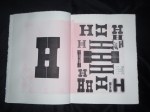
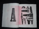
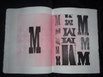
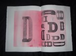
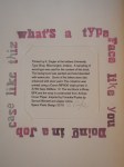
In Spring of 2010 I registered for Typography I. I ignored the requirements (I didn’t have them) and mentally prepared for an introduction to type history, aesthetics and analysis. My motive for taking the class was access to the type shop. A few weeks later I had a formal introduction. I still get faint thinking about it. Of course that could be the fumes.

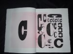
I never had enough time to master typesetting. I still don’t know when too much ink is too much. It takes me forever to register type. I’m a little vague on acceptable imprint depth. But it was so much fun. I only had time to set up one book on the press that semester. It was the result of exploring the many drawers of mismatching wood type.

Here is the result:

If anyone knows of a type shop in central Pennsylvania…


Barbara did it better

As usual, I’m lagging a bit (you know, a month, or two behind) on my projects and posts.

I completed Space Paste/Spring Leaf  project #5 for May. There was only one stipulation for the month: ephemera.

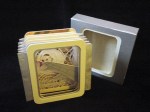
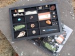
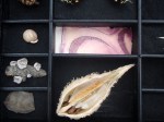
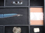
I have a small collecting problem when it comes to natural objects. Feathers, stones, twigs… they all end up in my pocket. This seemed like a perfect opportunity to reduce the piles of snail shells and seed pods cluttering my living space. With the help of a friend, I turned a warped job case into two curiosity cabinets. I placed a transient treasure in each compartment. Except one- in that compartment sits a small book filled with abstracted watercolor and ink drawings.

I was pleased with my creation. Until I visited the Lilly Library in July and got my hands on (thanks, Jim!) Wunder Cabinet by Barbara Hodgeson and Rollin Milroy. And may I just say, squeal! Inspired by the wunderkammern of Germany, these two constructed a beautifully crafted two-layered box containing an assortment of flora, fauna and oddities. Each piece is cataloged with curatorial diligence and corresponds with one of three books (paper made by Reg Lissel) included in the package. It was a delight to sort through each compartment and discover the keepsakes waiting for me.

Thanks, Barbara, for showing me how it’s done.