Topographia

Who doesn’t love a little geography? Topographia began as a project with Spring Leaf Press some time ago and gradually eroded. It resurfaced as I was going through the unfinished project pile. I struggled with choosing to complete it versus tossing the whole thing in the trash. I decided to keep the pages, but didn’t know how to finish them.

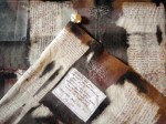
I moved one step closer to making an actual book by reinforcing the card stock pages with book cloth and sewing the text signatures onto tapes. I did it twice, because the initial thread I used wasn’t strong enough.

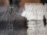
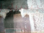
The book languished for another three months before I tackled it, largely because I wanted to participate in a rapidly approaching exhibit. When I first began the project, I imagined a three dimensional cover that represented a raised map, and I decided to run with that. I used book board as a base and paper mache to sculpt ridges and valleys. I cut slits in the book board beforehand to allow for the tapes to be threaded through it. Because I procrastinated, I needed my covers to dry quickly, so I popped them in the oven at 250 degrees. This decreased the drying time, but increased the warping. I put weights on the covers as they came out of the oven to help maintain flatness.

Next, I used acrylic paint to help the landscape along. Once it was dry, I threaded and glued in the tapes, leaving them exposed on the inside cover.

The end result reminds me a lot of a fifth grade diorama; rough, but full of charm.

I got it to the exhibit on time and displayed it with a few of my other artist’s books in June of 2017 (yipes!). There was great opening night participation, and it also turned out to be an interesting exercise in encouraging viewers to touch the art.

When I learned I was leaving for the left coast, I packed it up with other art paraphernalia and brought it along. It recently made another appearance at Hidden Villa’s Homesteading Day, where it mostly delighted kids of varying ages.

Maybe there’s some truth to the diorama.

Eat Your Vegetables

This book is untitled and was spawned from an ongoing Space Paste and Spring Leaf Press collaboration beginning in 2012. This exercise is from March to August of 2014 and the parameters included a miniature book constructed in a day using materials immediately available in the studio. I managed to successfully adhere to two out of the three and I’m good with that.

The book depicts the contents of my csa share  from GroundWork Farms for August 6, 2014. I used watercolor for the vegetable images. A piece of my favorite (but broken) hat, a hemp shoe string and a paste cloth spine became the cover. Other materials included Rives BFK (so predictable- who doesn’t have this in their studio?), archival ink and linen thread.

It was a fun exercise. I had a chance to play around with a material I don’t normally use- hat- and it was successful in creating a farmy feel. I also had an opportunity to incorporate my vegetable images into another venue. They are being used this September as a marketing tool for the  Duveneck Dinner, a fundraising event held by Hidden Villa, a nonprofit educational farm that provides a structure for learning about the environment and social justice in Los Altos Hills, California. Cool, yeah?


Charmed

I cannot resist artfully arranged baubles imbued with meaning arranged in vessels. I don’t think anyone can. Canopic jars, medicine bags, reliquaries, hoodoo- all longstanding examples of items blessed with significance.

I usually avoid making art that incorporates this because it’s akin to using the abandoned baby doll in a horror film. It always works. It’s compelling. Every. Single. Time.

I have succumbed.

A while back, my friend M.D. gave me a bunch of Pyrex bottles with stoppers. His lab was doing a Spring cleaning and he couldn’t bear to throw them away, so they ended up in his closet with an equally obscene amount of test tubes.  I used one of the bottles to make a gift for a friend; a blessing for her thirtieth birthday. I moved on to other projects, but those bottles kept resurfacing in my thoughts. I decided to make more. I have never spent so much time looking for items of specific symbolic significance in my life. It was really fun.

options

In the end, I made 10 bottles, all focusing on positive attributes.

all

For those interested in the specifics:

  1. Good fortune: New Zealand jade, paper crane, gold flakes, silver piece, green parrot feather; wrapped with green linen thread

2. Passion: thorns, match, cinnamon bark, red feather, amber; wrapped in red silk thread and cinnamon bark charm

passion

3. Renewal: snakeskin, robin’s egg, monarch wing; wrapped in white linen thread and a snail shell charm

renewal

4. Calm: beach glass, wool roving, dried lavender; wrapped in blue silk thread and a bell charm

5. Strength: Horsehair, porcupine quill, rock, obsidian arrowhead, shark tooth; wrapped in blue linen thread and a rock charm

6. Harmony: feather, quartz, match, fossilized shell; wrapped in salmon colored linen and a bell charm

group

7. Luck: wishbone, amber, parrot feather; wrapped in green linen thread and a paper crane charm

8. Wisdom: turtle vertebrae, acorn, scarab, black feather; wrapped in black silk thread and an owl charm

9. Protection: sage, salt, silver, circa 1870s evil eye; wrapped with maroon silk thread and a silver circle charm

10. Inspiration: pen nib, clear quartz, peacock feather, turtle bone, dragonfly wing; wrapped with yellow linen thread and a peacock feather charm

inspiration

Perhaps the next set will focus on darker aspects. Coffin nails, bird bones and grave dirt come to mind.


Hug?

In January of 2014, Mary and I began our monthly collaborative book projects once again. We were struggling by February. We decided on a two color print (because, somehow, that would take less time than a book). Mary completed hers, a stunning sea slug, that can be found for sale at her Etsy shop, only slightly behind schedule.

I took a little longer. I also picked an underwater creature, an urchin. I made screens, but I couldn’t get a smooth print no matter how much I tweaked it. I got frustrated and put it away.

Screens

Two months later, I made a lino-cut. It had been years, but digging into the linoleum was satisfying and renewed my latent love of block printing. Until it was time to print. I don’t have a press, so it was baren, or bust and I busted. The prints were spotty and uneven. I used water based ink and they dried too quickly. I put it away for many more months. In August, I visited Bloomington, Indiana for a few days. Mary and I planned a printing day using her press, but due to unforeseen circumstance, it turned into a printing hour (or two). I managed a few test prints, but nothing solid.

Linocut

Linocut

In September, my friend Abby invited my to an informal intaglio class. Determined to finally print The Urchin, I brought a copy with me. We used diamond point scribes to etch our images into plexiglass. Until then I had only etched in copper. I was delighted to discover the possibilities with plexi- it’s affordable, readily available and it is good for four to five prints. The limited run appeals to me, as does the DIY feel. And we had a press!

Etched Plexi

I only managed two prints before I had to be elsewhere. They’re rushed and dirty, but I’ll take ’em.

Hug? Blue

Hug? Pink

Hug? is what a friend of mine would call “bathroom art.” It elicits a smile and limited contemplation; something you find at the tourist shop, not the gallery shop. I never intended to put so much time into such a frivolous picture, yet after rendering it three different ways I chose to love it. It’s not fine art, but it’s got heart.

Eva Cassidy Sings the Flu

Last year Mary of Spring Leaf Press and I intended to continue our collaboration from 2012. Instead of doing monthly projects, we thought it would be prudent to complete four three month projects. We could devote more time to a book and have an end result that was intentional, finely crafted and multi-editioned (meaning more than two).

Turns out, that don’t work for us. Three months gave us time to define the parameters of our project and begin work. It also gave us time to get distracted by on-the-side conservation work, sewing silk dresses, family events, baking the perfect macaroons, The Walking Dead… you get the picture.

Despite life’s distractions, we each managed to complete one book exercise. As a concept, we chose a (then) current event to influence imagery and the lyrics of a song to act as text. I went with the winter’s flu epidemic and Eva Cassidy’s Fever.

At that time I was interested in playing with fiber and transparency. I used Japanese paper printed with my illustrations and information taken from the CDC’s website, cheesecloth and flour paste to build my pages. I did the same for the wrap around cover.

This project was time consuming due to the process I chose. However, I inadvertently added time due to human error. First, I created separate pages instead of spreads. While the former strategy was successful, the latter would have shortened the time I spent pasting significantly. I also spent a day working while it was particularly humid outside. I didn’t take that into account and ended up with a few moldy pages. I had to redo them. Grr. Lastly, perhaps the most galling mistake- I was working with a slightly warped ruler. Can you believe that! I kept making cuts that were not quite right. The answer finally dawned on me, but as a result my editions don’t have the margins I intended.

Overall, I am pleased with the way Fever turned out. It has a solid clinical feel and the gauze and texture of the cover and pages makes act of unwrapping it a little tense. The imagery, lyrics and flu trivia float amongst the pages, creating different levels of clarity, depth and the potential for multiple interpretations. A lot like a NyQuil buzz, actually.

Thank goodness flu season is finally over and we can begin to look forward to pollen allergies.

Fever; cover fever_titlepg fver_spread2 fever_spreadIV fever_spreadV fever_spreadVI fever_spreadVII fever_spreadVIII


Lena Louise

After taking a somewhat unintended year hiatus-no really- Spring Leaf Press and I returned to our monthly collaborations this January. Our first books of the year are about family.

I’ve been thinking about my grandmother a lot lately. She was kind, gentle, a competent nurse and referred to the female genitalia as a doo-lolly. She also made a killer coconut cake. Once she forgot to remove the wax paper from between the layers and that was an interesting surprise. As a kiddo I would ask her about her past and she was always reluctant to discuss it. I think she thought it wouldn’t be interesting to me. I regret not pushing harder. This book is about her- Lena Louise Pochyba (neé Long).

I turned one of her scarves I’ve been carrying around for years into paste cloth and collaged it with Japanese papers, reproductions of old photos, letters and a few words. The delicacy of the scarf and thinness of the papers resulted in a pleasing translucency and successfully invokes a feeling of nostalgia and age. The concertina format helped establish a timeline. The finishing touches included hand stitched thread around the text and a ribbon that can move freely through the covers and control the tautness of the text block (thanks, Mary!).

Cover      Closeup Kiddo      Mother Wife      Concertina

I love and miss you, Baba.

Inherent Vice

December marked the end of my year of monthly collaboration with Mary at Spring Leaf Press. Our final project emphasized communication without text, or representational images. Oddly enough, we both chose a similar technique to set the mood of our books.

I was reading about batik techniques and came across a process where one dropped wax on black velvet to protect the color and bleached out the remaining material. I decided to try the same technique with paper. I wanted my book to feel intimate, so I sized it to fit in the hand. I dipped the edges of each sheet in wax in order to maintain the original color and texture of the paper. Next, I saturated each sheet with black fiber reactive dye and while the paper was still wet applied a bleach solution. Although I directed the initial flow of bleach, the end result was unpredictable and each page was a surprise. I bound the pages with a chain stitch and made a wrap around case for it. When I flipped through the finished product, the pages gave me a sense of nostalgia and brought to mind polaroids with processing mishaps.

Mary and I are doing a second collaboration, with a new set of parameters for 2012.

The Book Artist Did It

November’s project between Space Paste Press and Spring Leaf Press taught me a valuable lesson in my continuing exploration of the book arts. I am a book maker, not a book modifier.

In what we thought would be an enjoyable change of pace, Mary and I decided to alter two books each. The books had to be under five dollars each and the alterations had to reflect the title. To prepare, I looked at a number of artists who use books as a medium including Guy Larame who fashions impressive paper landscapes and Melissa Jay Craig who creates organic, sculptural installations. Yet when I looked at my books- The Flaming Forest by James Oliver Curwood and The Victim by Thomas Dixon- I had no idea how to change them in a constructive, illustrative way, so I chose to alter them in a destructive way.

The Flaming Forest. Flaming. Fire. The answer was clear. As a book artist and lover of stories, the thought of burning a book was downright deviant. In the end, I was able to justify it- the book was old, and not in an out of print, first edition kind of way but in a stained, covered with mold, allergy attack waiting to happen kind of way. Armed with my father’s propane torch and a trusty poker, I reduced it to ashes. Those ashes went into an equally old glass bottle where it shares space with some carefully saved book scraps and hemlock needles. I sealed the bottle with beeswax and the contents continue to appear scorched and abandoned.

The Victim. The plum and green cover reminded me of The Butler Did It tales and dinner theatre. Someone was always done in. I borrowed another of my father’s tools, a 22, and shot passionate bullets into my victim. To cover up my crime, I tied the book up, attached it to a weight, and sunk it to the bottom of the lake (or more accurately, into the fish tank).

Thanks to this project, I know that I do not look at books and wonder what I can turn them into. Instead I look at raw materials and wonder how I can turn them into a book.

Sketch Up

October’s book art collaboration with Spring Leaf Press was meant to be simple; five sketches in five mediums- colored pencil, graphite, pen, watercolor and a print all wrapped up in a simple binding. I chose to draw some Japanese Anenomes growing in my father’s nursery.

And it was simple, but it was also…difficult. Not conceptually, but as an exercise in patience and skill. I procrastinated. I would sit down, stare at the flowers and pick up my pencil. Then I would get up and weed, or look at the clouds, take a walk, brew some tea. I started paying attention to what was going on in my head as I prepared to draw. I found myself questioning my abilities and troubled by thoughts of indeterminate judgement. What if this drawing isn’t any good? It won’t reflect my talents because I’m not taking enough time. Why am I so impatient? What if my ability is judged based on this single image? And on it went, without taking into account the drawing was supposed to be a sketch, not a perfect copy. Without taking into account this was an exercise, not fine art. Without taking into account that is was supposed to be fun and uncomplicated.

I finally focused enough to complete the sketches. They turned out fine. I am stronger in some mediums than others and the images reflect that (colored pencils, yuck). I’d like to say I had a breakthrough, but I realize that much of my work is only completed after prolonged procrastination and I am rarely happy with the results. Recognizing my approach to this exercise helped remind me that it is better to produce flawed pieces and enjoy the process, rather than put off potential perfection and complete nothing.

Destroying Angel

I’ve been a little obsessed with fungus lately. It’s because of the rain. All sorts of varieties are showing up- Turkey Tail, Chicken of the Woods, jellies and corals. Some are edible, some, not so much. For example, the Destroying Angel is one of the most toxic mushrooms in North America. Once eaten, flu-like symptoms develop within 4 to 12 hours. After a period of sickness, the symptoms disappear for approximately 24 hours. If the signs of amatoxin poisoning are not recognized in time, the liver shuts down followed by a hepatic coma. Most people never wake up. Don’t eat it!

Anyway, mushrooms, specifically, the Destroying Angel, was my focus for September’s collaborative Space Paste/Spring Leaf exercise. There were two controls, a scroll format and science.

The body of my scroll is hand-dyed cotton. The pattern is a result of paste resist. The imagery consists computer generated iron on transfers (the science!), thread drawings and fabricated journal entries about a father-son hiking trip gone wrong.

If you would like to read an account of someone who survived ingesting the Destroying Angel, check out Richard Eshelmans’ post on the Cornell Mushroom Blog.