Eva Cassidy Sings the Flu

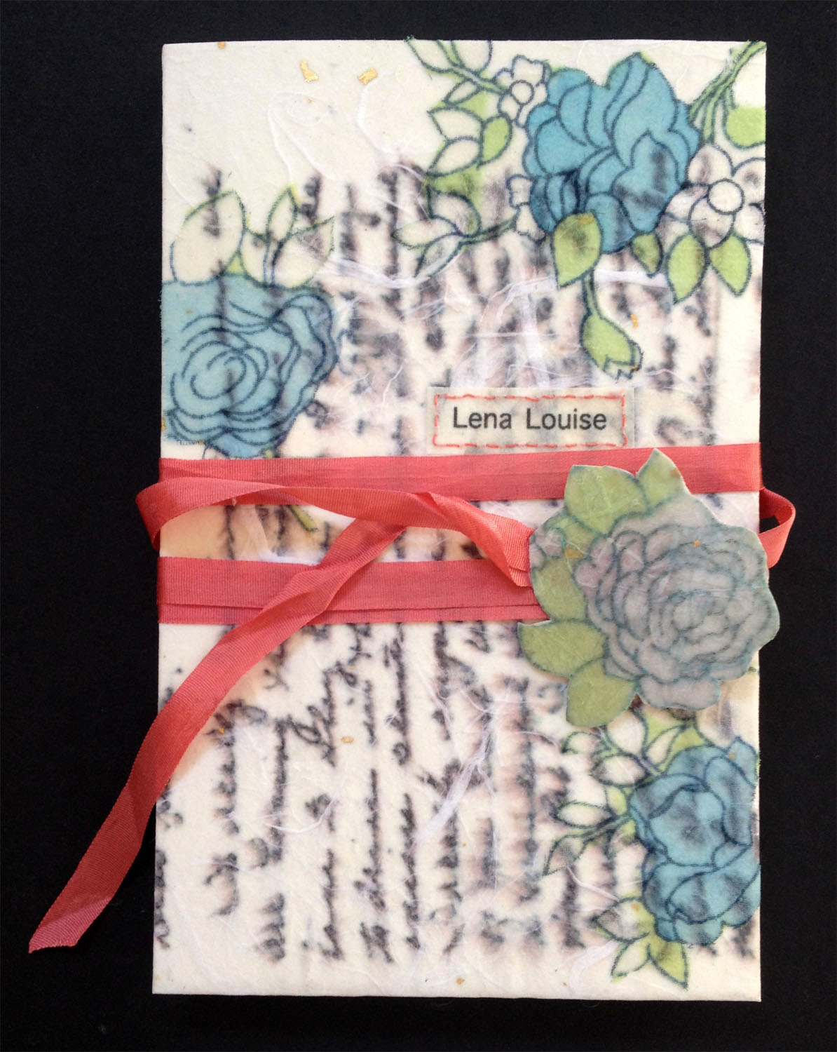
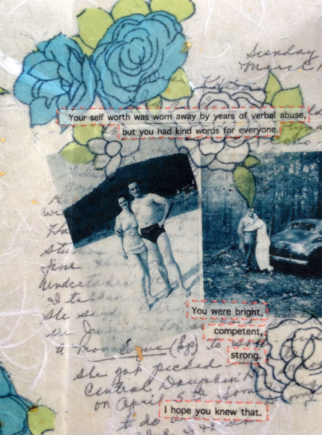
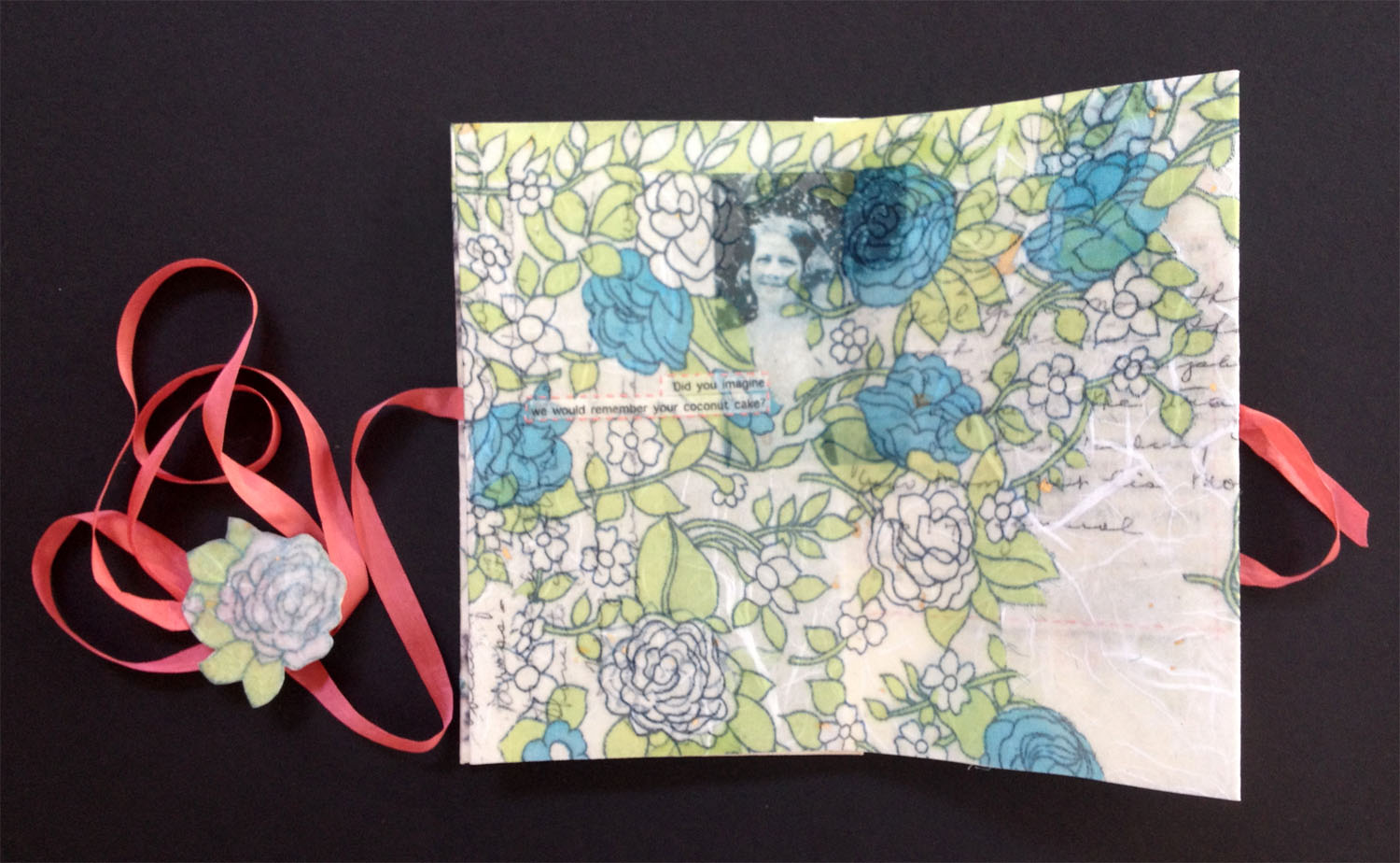
Last year Mary of Spring Leaf Press and I intended to continue our collaboration from 2012. Instead of doing monthly projects, we thought it would be prudent to complete four three month projects. We could devote more time to a book and have an end result that was intentional, finely crafted and multi-editioned (meaning more than two).

Turns out, that don’t work for us. Three months gave us time to define the parameters of our project and begin work. It also gave us time to get distracted by on-the-side conservation work, sewing silk dresses, family events, baking the perfect macaroons, The Walking Dead… you get the picture.

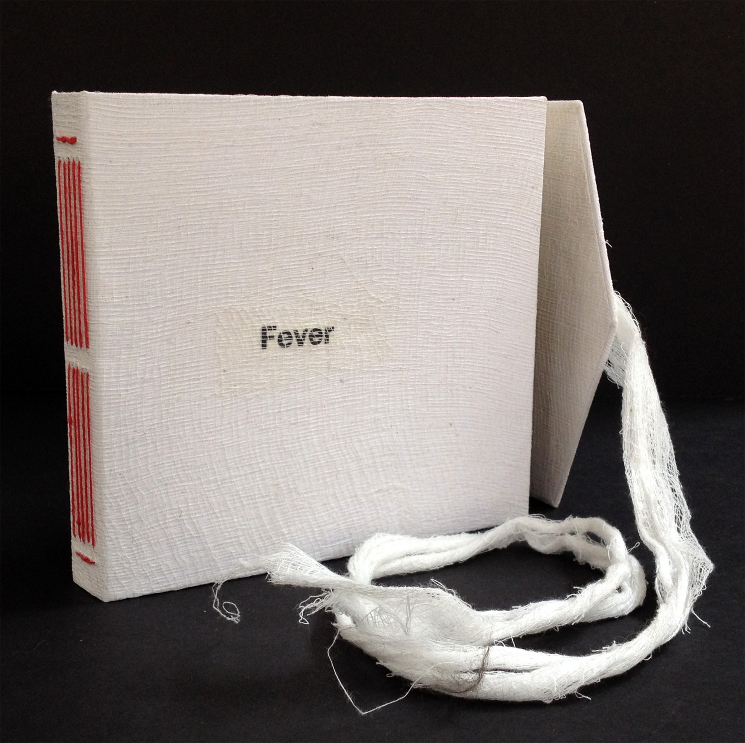
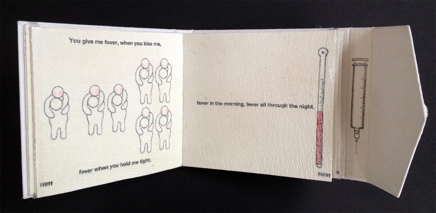
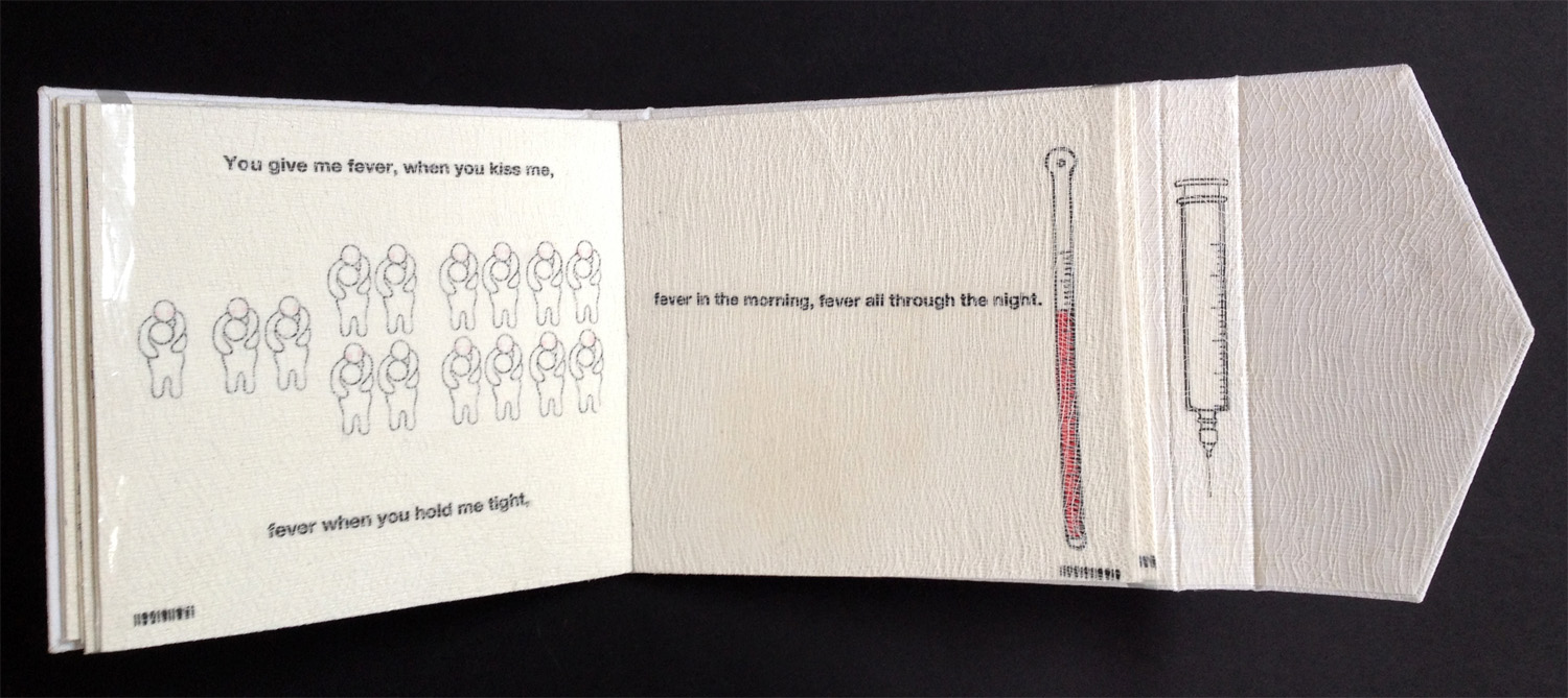
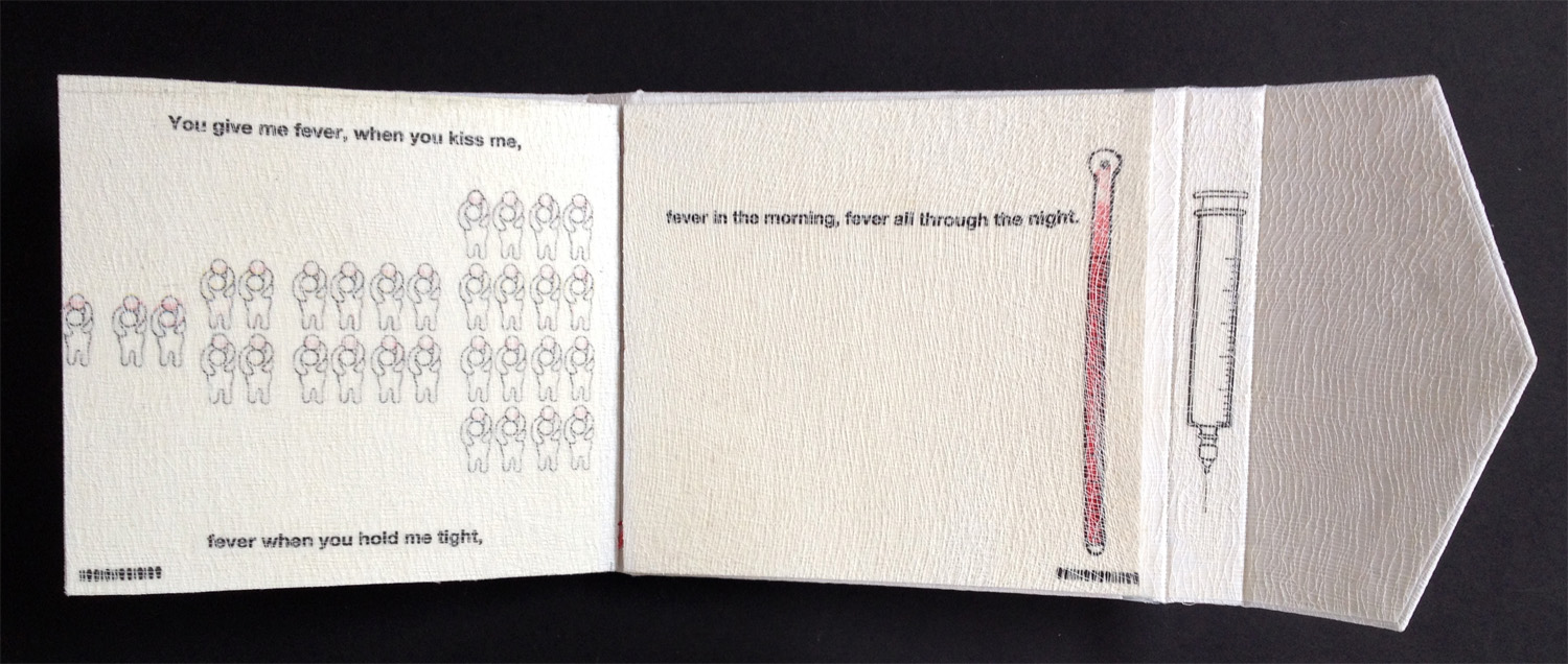
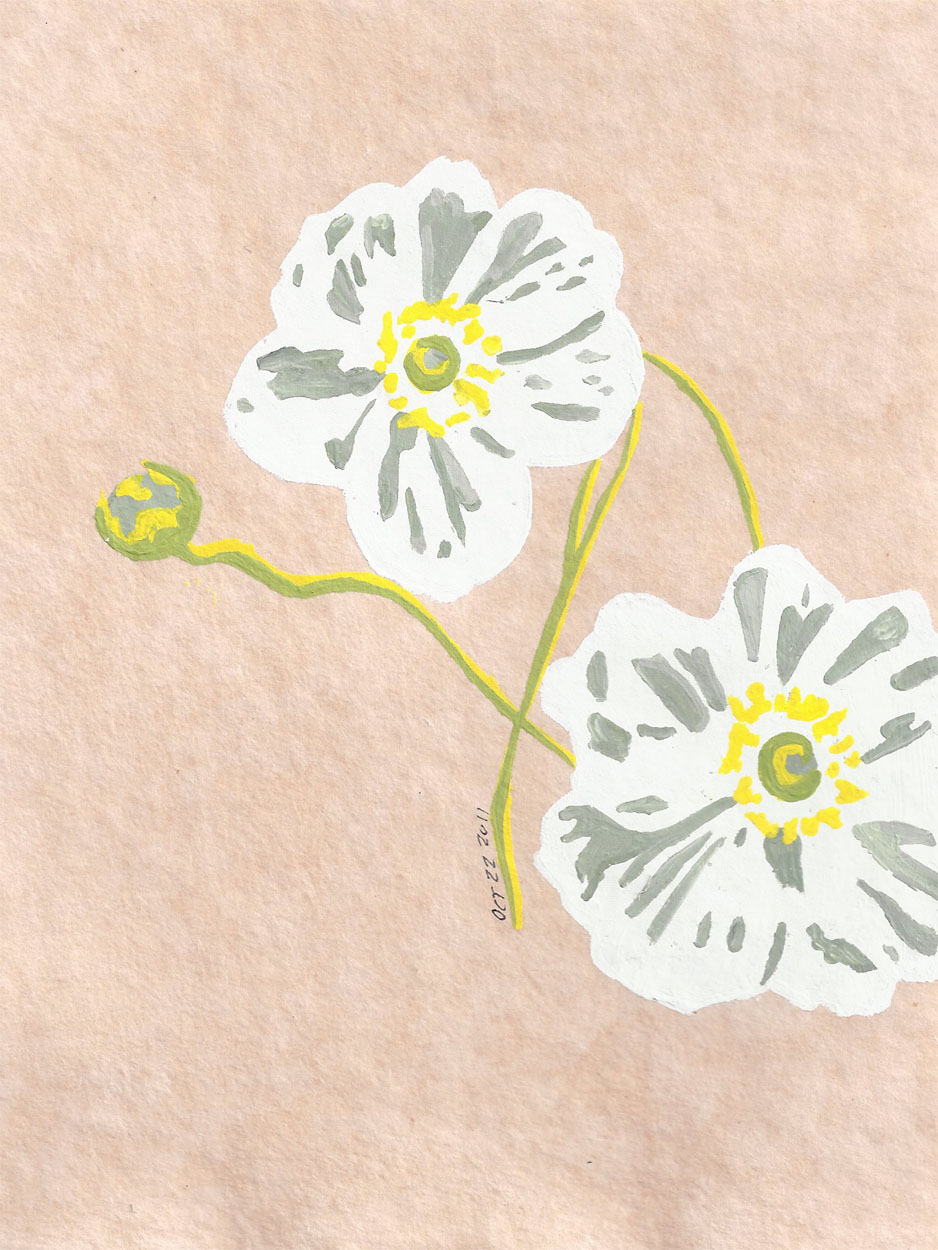
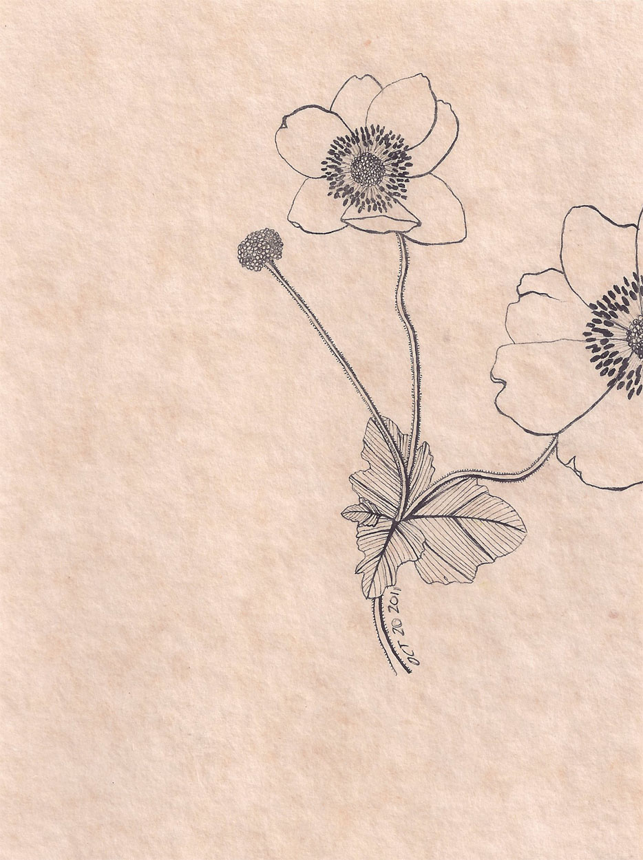
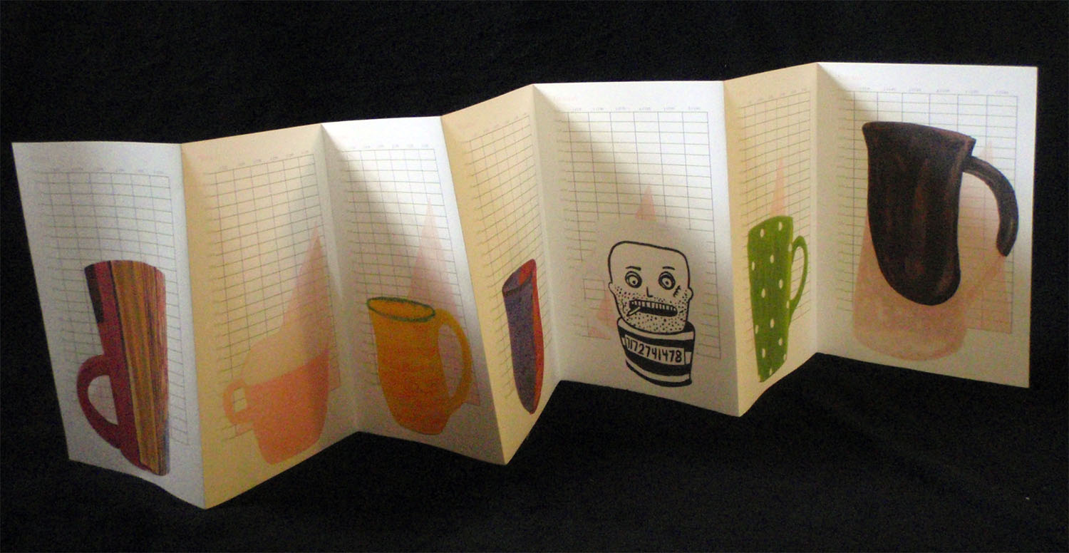
Despite life’s distractions, we each managed to complete one book exercise. As a concept, we chose a (then) current event to influence imagery and the lyrics of a song to act as text. I went with the winter’s flu epidemic and Eva Cassidy’s Fever.

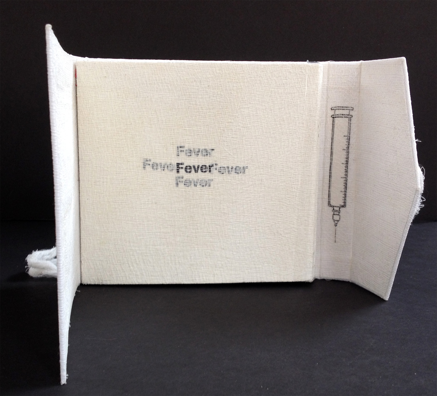
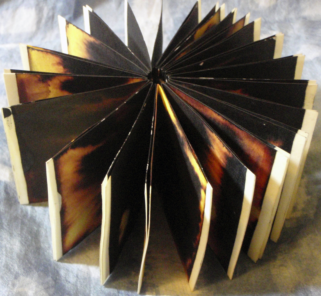
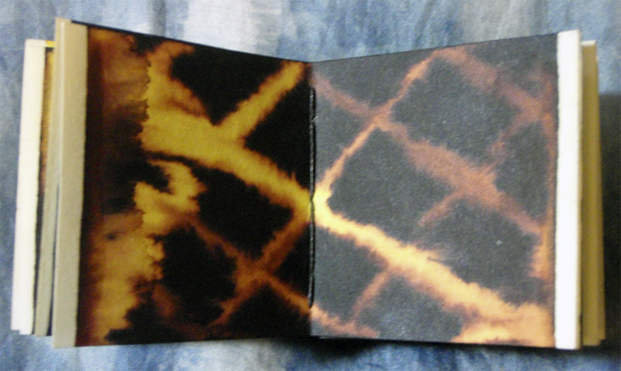
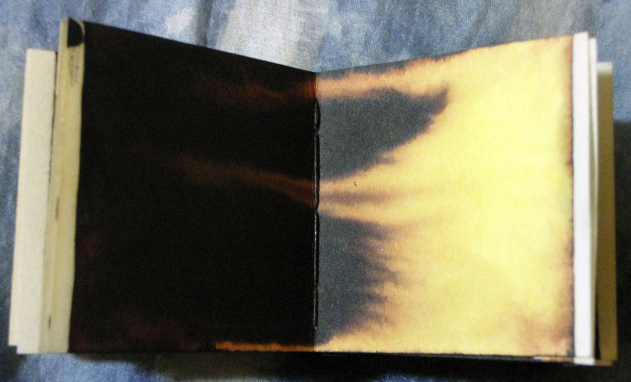
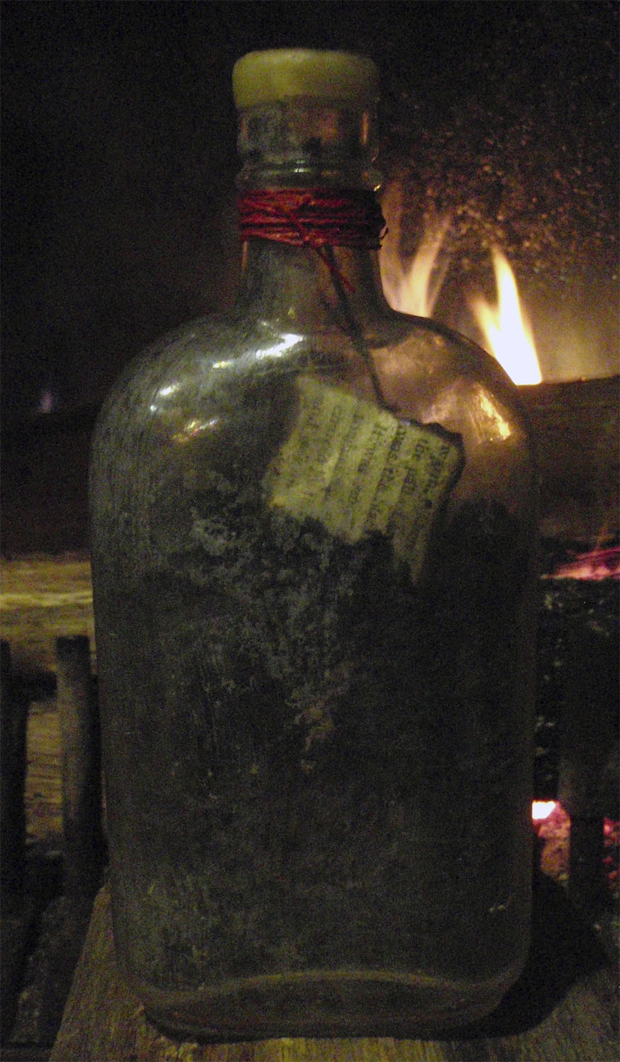
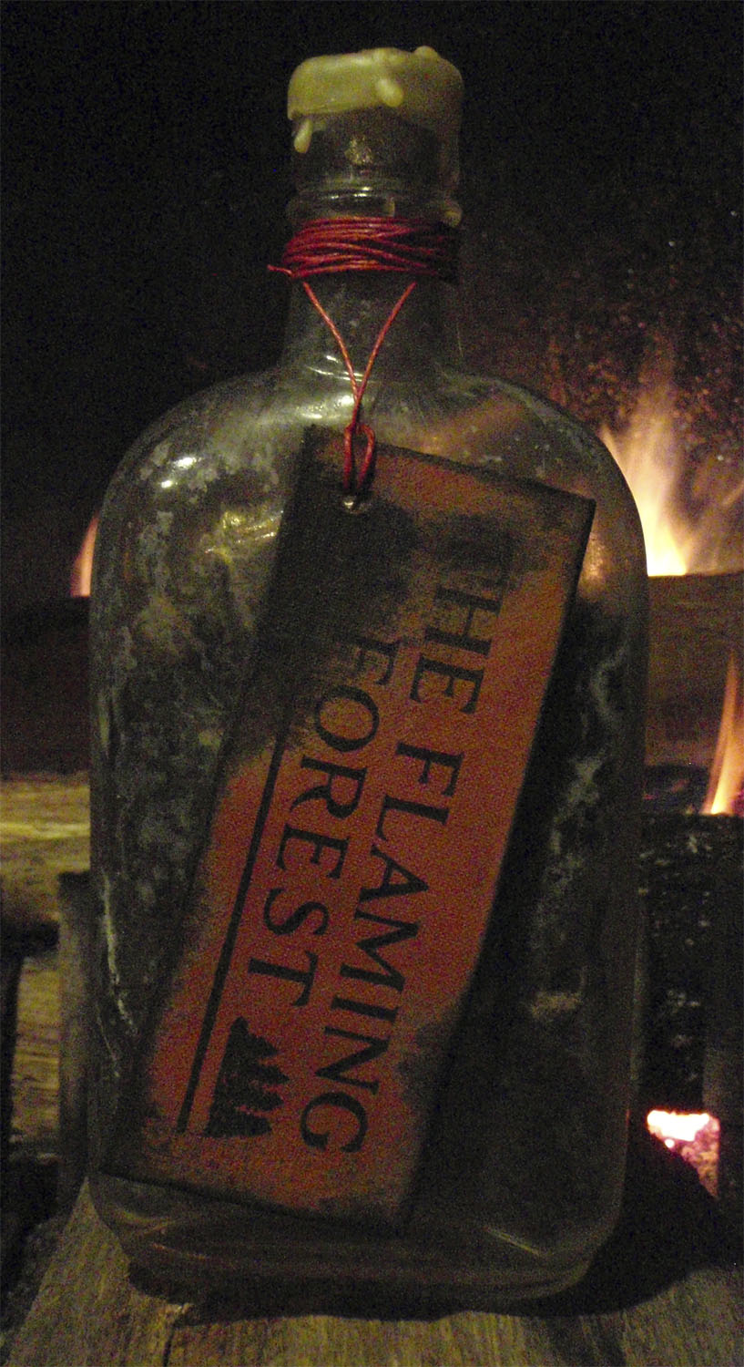
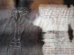
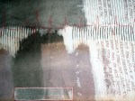
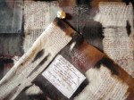
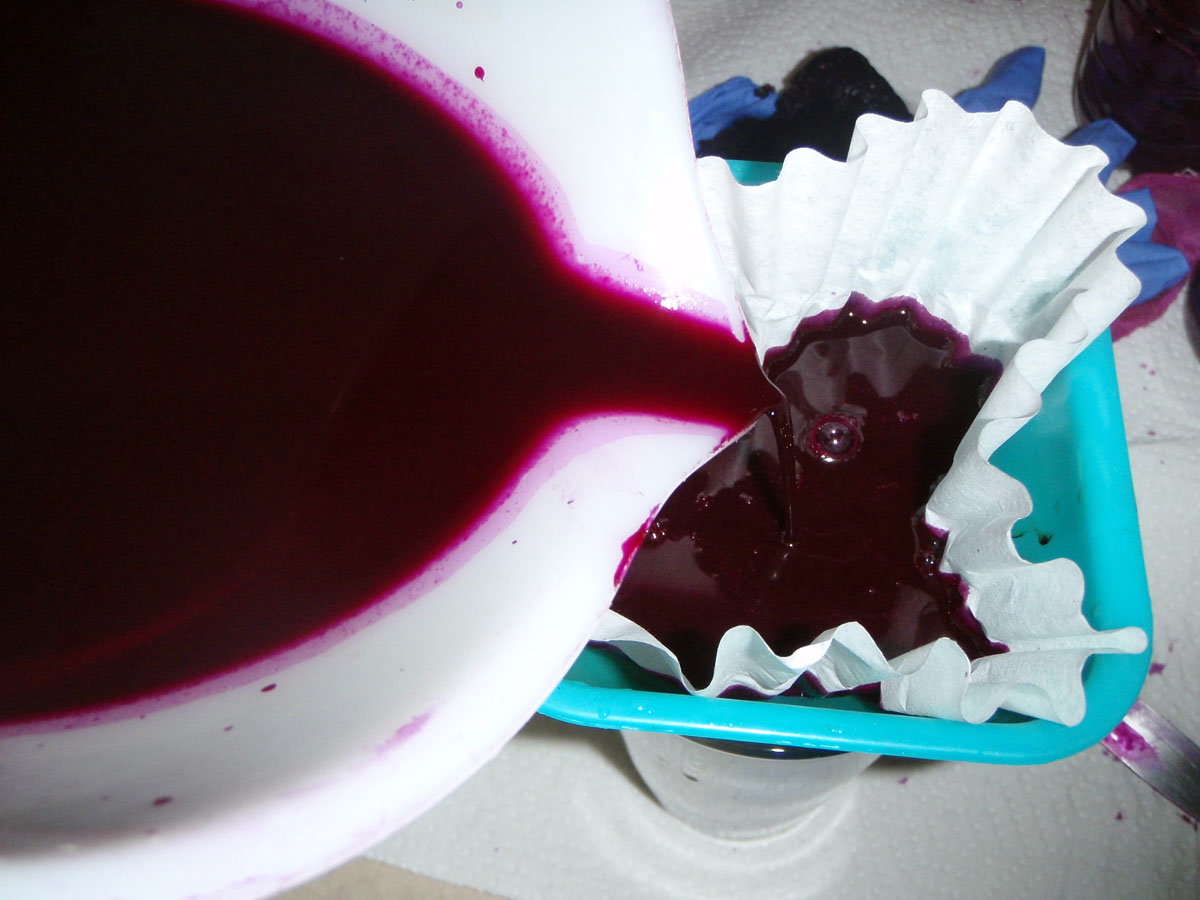
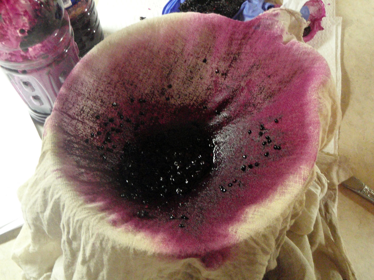
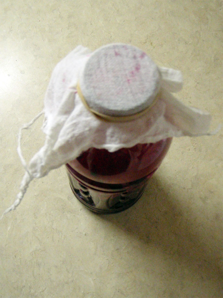
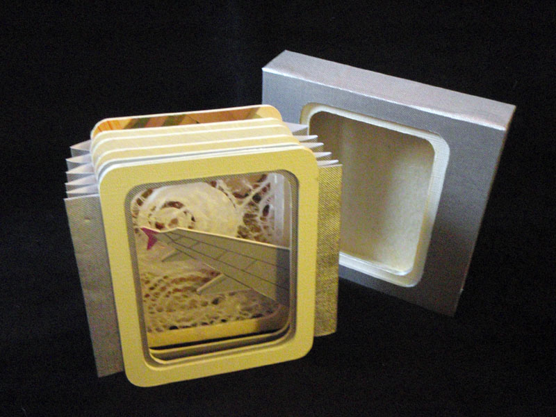
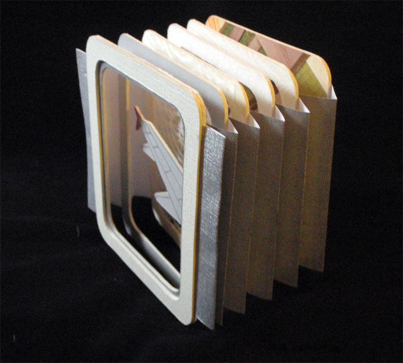
At that time I was interested in playing with fiber and transparency. I used Japanese paper printed with my illustrations and information taken from the CDC’s website, cheesecloth and flour paste to build my pages. I did the same for the wrap around cover.

This project was time consuming due to the process I chose. However, I inadvertently added time due to human error. First, I created separate pages instead of spreads. While the former strategy was successful, the latter would have shortened the time I spent pasting significantly. I also spent a day working while it was particularly humid outside. I didn’t take that into account and ended up with a few moldy pages. I had to redo them. Grr. Lastly, perhaps the most galling mistake- I was working with a slightly warped ruler. Can you believe that! I kept making cuts that were not quite right. The answer finally dawned on me, but as a result my editions don’t have the margins I intended.

Overall, I am pleased with the way Fever turned out. It has a solid clinical feel and the gauze and texture of the cover and pages makes act of unwrapping it a little tense. The imagery, lyrics and flu trivia float amongst the pages, creating different levels of clarity, depth and the potential for multiple interpretations. A lot like a NyQuil buzz, actually.

Thank goodness flu season is finally over and we can begin to look forward to pollen allergies.

Fever; cover fever_titlepg fver_spread2 fever_spreadIV fever_spreadV fever_spreadVI fever_spreadVII fever_spreadVIII


Lena Louise

After taking a somewhat unintended year hiatus-no really- Spring Leaf Press and I returned to our monthly collaborations this January. Our first books of the year are about family.

I’ve been thinking about my grandmother a lot lately. She was kind, gentle, a competent nurse and referred to the female genitalia as a doo-lolly. She also made a killer coconut cake. Once she forgot to remove the wax paper from between the layers and that was an interesting surprise. As a kiddo I would ask her about her past and she was always reluctant to discuss it. I think she thought it wouldn’t be interesting to me. I regret not pushing harder. This book is about her- Lena Louise Pochyba (neé Long).

I turned one of her scarves I’ve been carrying around for years into paste cloth and collaged it with Japanese papers, reproductions of old photos, letters and a few words. The delicacy of the scarf and thinness of the papers resulted in a pleasing translucency and successfully invokes a feeling of nostalgia and age. The concertina format helped establish a timeline. The finishing touches included hand stitched thread around the text and a ribbon that can move freely through the covers and control the tautness of the text block (thanks, Mary!).

Cover      Closeup Kiddo      Mother Wife      Concertina

I love and miss you, Baba.

Inherent Vice

December marked the end of my year of monthly collaboration with Mary at Spring Leaf Press. Our final project emphasized communication without text, or representational images. Oddly enough, we both chose a similar technique to set the mood of our books.

I was reading about batik techniques and came across a process where one dropped wax on black velvet to protect the color and bleached out the remaining material. I decided to try the same technique with paper. I wanted my book to feel intimate, so I sized it to fit in the hand. I dipped the edges of each sheet in wax in order to maintain the original color and texture of the paper. Next, I saturated each sheet with black fiber reactive dye and while the paper was still wet applied a bleach solution. Although I directed the initial flow of bleach, the end result was unpredictable and each page was a surprise. I bound the pages with a chain stitch and made a wrap around case for it. When I flipped through the finished product, the pages gave me a sense of nostalgia and brought to mind polaroids with processing mishaps.

Mary and I are doing a second collaboration, with a new set of parameters for 2012.

The Book Artist Did It

November’s project between Space Paste Press and Spring Leaf Press taught me a valuable lesson in my continuing exploration of the book arts. I am a book maker, not a book modifier.

In what we thought would be an enjoyable change of pace, Mary and I decided to alter two books each. The books had to be under five dollars each and the alterations had to reflect the title. To prepare, I looked at a number of artists who use books as a medium including Guy Larame who fashions impressive paper landscapes and Melissa Jay Craig who creates organic, sculptural installations. Yet when I looked at my books- The Flaming Forest by James Oliver Curwood and The Victim by Thomas Dixon- I had no idea how to change them in a constructive, illustrative way, so I chose to alter them in a destructive way.

The Flaming Forest. Flaming. Fire. The answer was clear. As a book artist and lover of stories, the thought of burning a book was downright deviant. In the end, I was able to justify it- the book was old, and not in an out of print, first edition kind of way but in a stained, covered with mold, allergy attack waiting to happen kind of way. Armed with my father’s propane torch and a trusty poker, I reduced it to ashes. Those ashes went into an equally old glass bottle where it shares space with some carefully saved book scraps and hemlock needles. I sealed the bottle with beeswax and the contents continue to appear scorched and abandoned.

The Victim. The plum and green cover reminded me of The Butler Did It tales and dinner theatre. Someone was always done in. I borrowed another of my father’s tools, a 22, and shot passionate bullets into my victim. To cover up my crime, I tied the book up, attached it to a weight, and sunk it to the bottom of the lake (or more accurately, into the fish tank).

Thanks to this project, I know that I do not look at books and wonder what I can turn them into. Instead I look at raw materials and wonder how I can turn them into a book.

Sketch Up

October’s book art collaboration with Spring Leaf Press was meant to be simple; five sketches in five mediums- colored pencil, graphite, pen, watercolor and a print all wrapped up in a simple binding. I chose to draw some Japanese Anenomes growing in my father’s nursery.

And it was simple, but it was also…difficult. Not conceptually, but as an exercise in patience and skill. I procrastinated. I would sit down, stare at the flowers and pick up my pencil. Then I would get up and weed, or look at the clouds, take a walk, brew some tea. I started paying attention to what was going on in my head as I prepared to draw. I found myself questioning my abilities and troubled by thoughts of indeterminate judgement. What if this drawing isn’t any good? It won’t reflect my talents because I’m not taking enough time. Why am I so impatient? What if my ability is judged based on this single image? And on it went, without taking into account the drawing was supposed to be a sketch, not a perfect copy. Without taking into account this was an exercise, not fine art. Without taking into account that is was supposed to be fun and uncomplicated.

I finally focused enough to complete the sketches. They turned out fine. I am stronger in some mediums than others and the images reflect that (colored pencils, yuck). I’d like to say I had a breakthrough, but I realize that much of my work is only completed after prolonged procrastination and I am rarely happy with the results. Recognizing my approach to this exercise helped remind me that it is better to produce flawed pieces and enjoy the process, rather than put off potential perfection and complete nothing.

Destroying Angel

I’ve been a little obsessed with fungus lately. It’s because of the rain. All sorts of varieties are showing up- Turkey Tail, Chicken of the Woods, jellies and corals. Some are edible, some, not so much. For example, the Destroying Angel is one of the most toxic mushrooms in North America. Once eaten, flu-like symptoms develop within 4 to 12 hours. After a period of sickness, the symptoms disappear for approximately 24 hours. If the signs of amatoxin poisoning are not recognized in time, the liver shuts down followed by a hepatic coma. Most people never wake up. Don’t eat it!

Anyway, mushrooms, specifically, the Destroying Angel, was my focus for September’s collaborative Space Paste/Spring Leaf exercise. There were two controls, a scroll format and science.

The body of my scroll is hand-dyed cotton. The pattern is a result of paste resist. The imagery consists computer generated iron on transfers (the science!), thread drawings and fabricated journal entries about a father-son hiking trip gone wrong.

If you would like to read an account of someone who survived ingesting the Destroying Angel, check out Richard Eshelmans’ post on the Cornell Mushroom Blog.

Pokeberry Ink

Say “Gumbi.” Pokey! Or, in this case, pokeberry.
Pokeweed is a toxic (yet edible if prepared correctly) perennial plant with a bright pinkpinkpink stalk and dark purple, almost black berries. The berries produce a vibrant fuchsia juice that can be used for dye and ink. Unfortunately, the color, although striking, does not have good longevity. Since I’ve been on an ink making kick with the black walnuts I decided to try a pokeberry ink recipe I found through the The Fountain Pen Network (there is also an interesting discussion of the process and the ink results). It uses yeast to ferment the berries in order to preserve the ink (although denatured alcohol might do the trick).
Materials: Pokeberries, 2 20 oz clean plastic bottles, cheesecloth/coffee filter, gloves, rubber band, package of yeast, large bowl, gum arabic (if desired)
Pick and wash 8 ounces of ripe berries (I did a triple batch) and funnel into a 20 oz plastic bottle. Screw on the cap and shake vigorously until the berries are pulpy.
Remove the cap and pour one package of yeast into the bottle. Replace cap and shake again so the yeast is dispersed. I also put two teaspoons of gum arabic (found in powdered and solution form in most art stores) in my ink in order to emulsify the dye and help the ink bind to the page.
Remove cap and replace with a square of  cheesecloth and secure with a rubber band. Place the bottle in the dark at room temperature for at least 24 hours.
Using a larger piece of cheesecloth, strain the contents of the bottle into a bowl.
Place a coffee filter in a funnel and the funnel into a clean bottle. Slowly pour the unfiltered liquid into it. This process can take a few hours. If you are impatient you can squeeze the filter, but be gentle- the fiber breaks easily.
Transfer ink into a container of your choice and store away from direct light.

Dye, dye, dye, my darling

It’s autumn! The days are getting shorter, the squash is ready to harvest and the black walnuts are staining the roads of Central Pennsylvania. Not only do they stain the roads, but anything else they come in contact with, which makes black walnuts a popular and easy source of natural dye and ink. There are many recipes floating around on the interwebs but as long as one has walnut husks, water and heat, there should be success.

Here is one more ink recipe to add to the mix:

Materials: black walnuts, plastic bucket/bag, stainless steel 2 gallon pot, stirrer, gloves, cheesecloth/coffee filters, funnel, rubberband, denatured alcohol, large bowl, clean 20 oz bottle, gum arabic (if desired)

Collect the desired amount of black walnuts. I used about 20 walnut husks (more will increase the concentration, less will decrease it).

Put the fruit in a bucket, or bag and let it break down (I filled a bucket with water left the walnuts in it).  It is ideal when the outside husks have oxidized and are completely black. The green fruit will give dye, but they are difficult to peel.

Wearing a pair of disposable gloves, peel the walnuts and reserve the husks. Meanwhile fill pot about two thirds with water (I used the water from my bucket) and heat until boiling.

Put the husks into the pot and simmer for an hour. After the hour is up, begin checking the color of your dye. Black Walnut gives anywhere from a pale sienna to a rich dark brown (adding iron, like nails, results in a brown-black color).

When you are satisfied with your color, remove pot from heat and allow it to cool. At this point the contents look like black sludge.

Place cheesecloth over a bowl and secure with a rubberband. Slowly pour the pot’s contents over the cheesecloth. The sludge will remain on top, while the liquid filters into the bowl. Wrap up the cloth and squeeze to release the remaining liquid.

At this point I added 4 teaspoons of gum arabic to act as an emulsifier and help the ink bind to the page.

To filter the liquid more finely, place a coffee filter into a funnel, the funnel into a 20 oz bottle and slowly pour in the liquid. It takes a few hours for the liquid to drip through. If you are impatient, you can gently agitate the filter, but the fibers break easily.

Add 5% denatured alcohol to the resulting volume of ink (for example, I ended up with 32 oz. of ink, so I added  1.6 oz. alcohol). Denatured alcohol is available at any hardware store in the paint section. This keeps mold and bacteria from growing in the ink.

Tea, anyone?

I love a well brewed cup of tea. I hold the warm mug in my hands, watch the steam curl into the ether and mentally go over my to-do list. Which brings me to my incredibly delinquent June collaborative project with Spring Leaf Press.

If memory recalls (it was four months ago. Yipes!), there was only one rule of engagement; a record of time passing. I graphed my tea consumption over the course of a week. I initially imagined this exercise on a heavy weight paper with mug screen prints placed solidly on top of one transparent chart, all folded neatly into a concertina format. Due to time constraints, I made some changes. I kept the format so that the information could be addressed a page at a time, or all at once. Instead of cutting stencils, I painted a watercolor image of each mug in my cupboard. I scanned them into photoshop and did the rest of the imagery there. Individual graphs took the place of a master chart. I had the book printed at Office Max on a thin, slick paper. In the end, the book has a more disposable feel (much like take out cups on the way to the office) than I originally anticipated, but it seems appropriate. The implied heaviness of the drinkware printed on the flimsy material creates subtle tension between permanent and provisional use.

Now, if you’ll excuse me, I need to brew some tea.

Thank You for Flying Flight 67

George Carlin gave a spiel about airlines that changed the way I think about the language of flying. Now I smile every time I get on a plane. In early September I booked a flight with U.S. Airways to Seattle, Wa. with a layover in Philadelphia. I prefer a left window seat. I like to stare into the clouds and pretend it’s the flower sea in the Voyage of the Dawn Treader (then I, ahem, ponder other, more academic things). As my thoughts wander, I  also spend a lot of time looking down at the patchwork of farmland that covers the ground. That visage was the inspiration for my Spring Leaf/Space Paste exercise for August.

Mary and I decided on a tunnel book format with five frames. One line of text determined the theme.

This was my first time constructing a tunnel book, so I made two mock ups. I chose matte board for my panels and had impressive blisters by the time I was done cutting the demo and the final copies. I used a variety of novelty papers to represent clouds and farmland. My line of text is adhered on the back- Flight 67. Seattle, Wa to Philadelphia, Pa.