Destroying Angel

I’ve been a little obsessed with fungus lately. It’s because of the rain. All sorts of varieties are showing up- Turkey Tail, Chicken of the Woods, jellies and corals. Some are edible, some, not so much. For example, the Destroying Angel is one of the most toxic mushrooms in North America. Once eaten, flu-like symptoms develop within 4 to 12 hours. After a period of sickness, the symptoms disappear for approximately 24 hours. If the signs of amatoxin poisoning are not recognized in time, the liver shuts down followed by a hepatic coma. Most people never wake up. Don’t eat it!

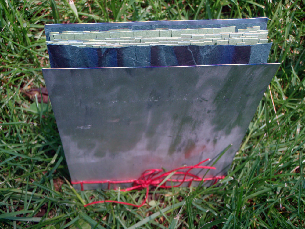
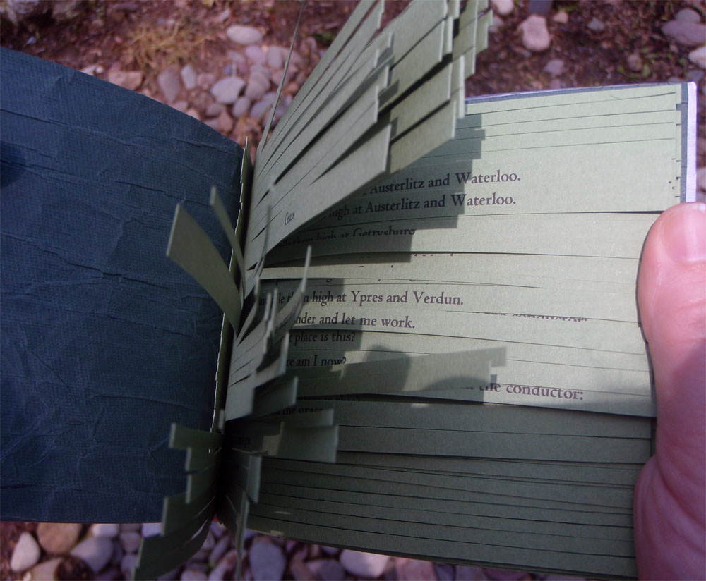
Anyway, mushrooms, specifically, the Destroying Angel, was my focus for September’s collaborative Space Paste/Spring Leaf exercise. There were two controls, a scroll format and science.

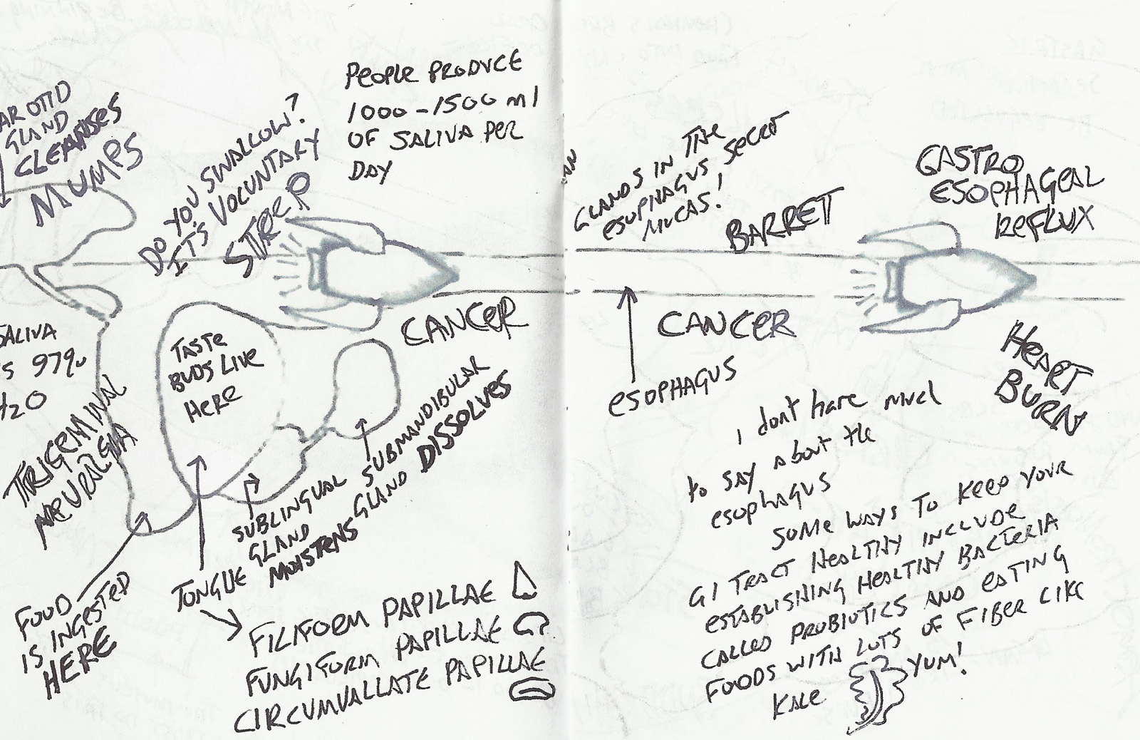
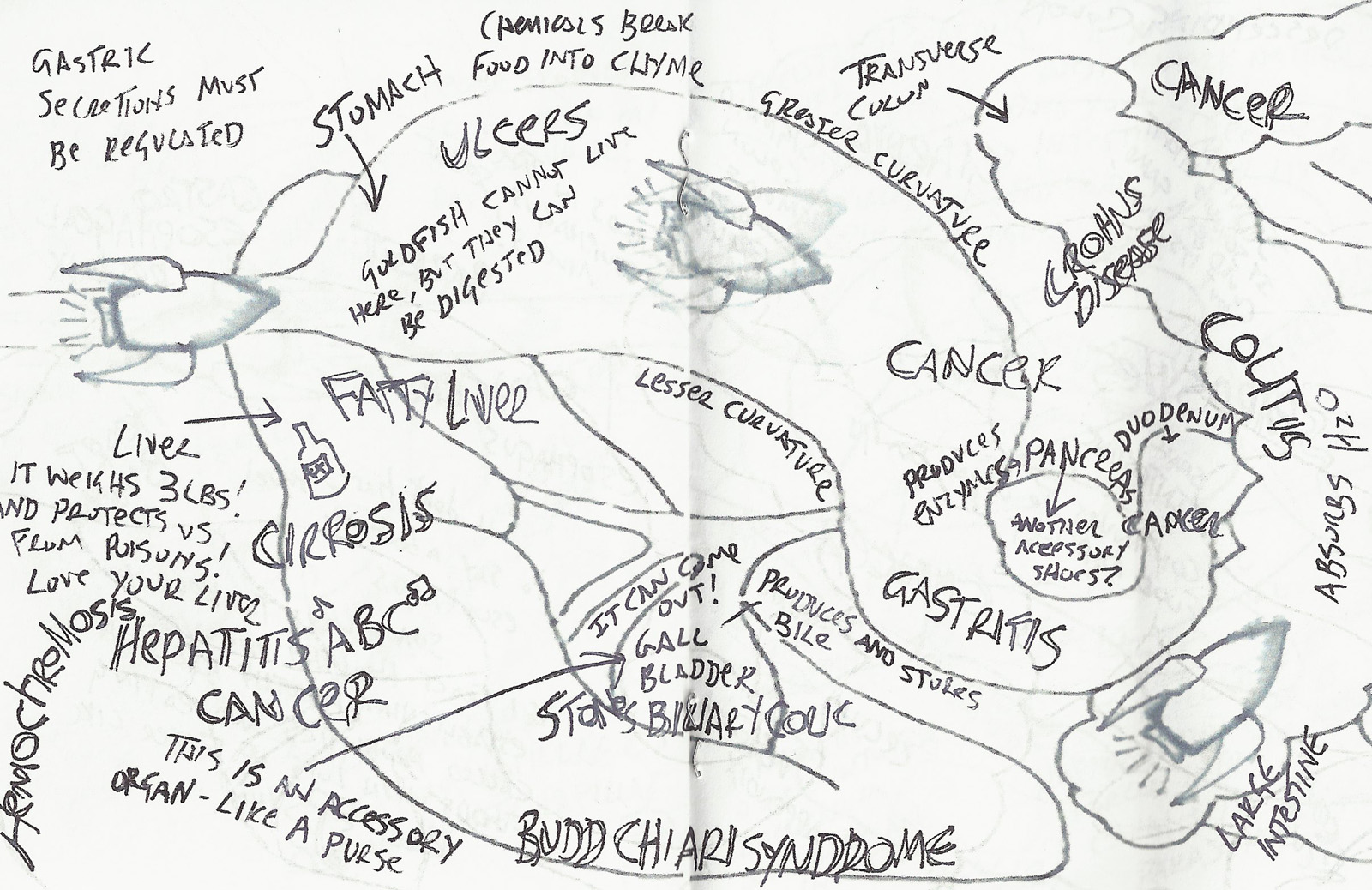
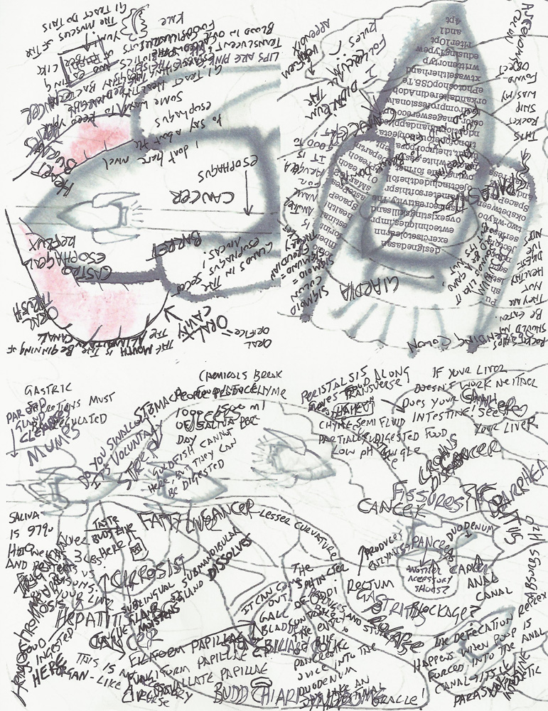
The body of my scroll is hand-dyed cotton. The pattern is a result of paste resist. The imagery consists computer generated iron on transfers (the science!), thread drawings and fabricated journal entries about a father-son hiking trip gone wrong.

If you would like to read an account of someone who survived ingesting the Destroying Angel, check out Richard Eshelmans’ post on the Cornell Mushroom Blog.

Tea, anyone?

I love a well brewed cup of tea. I hold the warm mug in my hands, watch the steam curl into the ether and mentally go over my to-do list. Which brings me to my incredibly delinquent June collaborative project with Spring Leaf Press.

If memory recalls (it was four months ago. Yipes!), there was only one rule of engagement; a record of time passing. I graphed my tea consumption over the course of a week. I initially imagined this exercise on a heavy weight paper with mug screen prints placed solidly on top of one transparent chart, all folded neatly into a concertina format. Due to time constraints, I made some changes. I kept the format so that the information could be addressed a page at a time, or all at once. Instead of cutting stencils, I painted a watercolor image of each mug in my cupboard. I scanned them into photoshop and did the rest of the imagery there. Individual graphs took the place of a master chart. I had the book printed at Office Max on a thin, slick paper. In the end, the book has a more disposable feel (much like take out cups on the way to the office) than I originally anticipated, but it seems appropriate. The implied heaviness of the drinkware printed on the flimsy material creates subtle tension between permanent and provisional use.

Now, if you’ll excuse me, I need to brew some tea.

Thank You for Flying Flight 67

George Carlin gave a spiel about airlines that changed the way I think about the language of flying. Now I smile every time I get on a plane. In early September I booked a flight with U.S. Airways to Seattle, Wa. with a layover in Philadelphia. I prefer a left window seat. I like to stare into the clouds and pretend it’s the flower sea in the Voyage of the Dawn Treader (then I, ahem, ponder other, more academic things). As my thoughts wander, I  also spend a lot of time looking down at the patchwork of farmland that covers the ground. That visage was the inspiration for my Spring Leaf/Space Paste exercise for August.

Mary and I decided on a tunnel book format with five frames. One line of text determined the theme.

This was my first time constructing a tunnel book, so I made two mock ups. I chose matte board for my panels and had impressive blisters by the time I was done cutting the demo and the final copies. I used a variety of novelty papers to represent clouds and farmland. My line of text is adhered on the back- Flight 67. Seattle, Wa to Philadelphia, Pa.

Helvetica and Futura walk into a bar

The bartender took a long, hard look at them and said, “Don’t make me get the serif.”

In Spring of 2010 I registered for Typography I. I ignored the requirements (I didn’t have them) and mentally prepared for an introduction to type history, aesthetics and analysis. My motive for taking the class was access to the type shop. A few weeks later I had a formal introduction. I still get faint thinking about it. Of course that could be the fumes.

I never had enough time to master typesetting. I still don’t know when too much ink is too much. It takes me forever to register type. I’m a little vague on acceptable imprint depth. But it was so much fun. I only had time to set up one book on the press that semester. It was the result of exploring the many drawers of mismatching wood type.

Here is the result:

If anyone knows of a type shop in central Pennsylvania…


Barbara did it better

As usual, I’m lagging a bit (you know, a month, or two behind) on my projects and posts.

I completed Space Paste/Spring Leaf  project #5 for May. There was only one stipulation for the month: ephemera.

I have a small collecting problem when it comes to natural objects. Feathers, stones, twigs… they all end up in my pocket. This seemed like a perfect opportunity to reduce the piles of snail shells and seed pods cluttering my living space. With the help of a friend, I turned a warped job case into two curiosity cabinets. I placed a transient treasure in each compartment. Except one- in that compartment sits a small book filled with abstracted watercolor and ink drawings.

I was pleased with my creation. Until I visited the Lilly Library in July and got my hands on (thanks, Jim!) Wunder Cabinet by Barbara Hodgeson and Rollin Milroy. And may I just say, squeal! Inspired by the wunderkammern of Germany, these two constructed a beautifully crafted two-layered box containing an assortment of flora, fauna and oddities. Each piece is cataloged with curatorial diligence and corresponds with one of three books (paper made by Reg Lissel) included in the package. It was a delight to sort through each compartment and discover the keepsakes waiting for me.

Thanks, Barbara, for showing me how it’s done.

The Grass is Green

Two posts within forty-eight hours! I win!

I finished April’s desperately overdue book activity a few days ago. The rules of engagement were: wax poetic and use a non adhesive binding. Choosing the text for this project made me crazy! Initially I wanted to use the poetry of a friend, but he wasn’t thrilled about others reading the musings of his early twenties. Then, I found some limericks written by my grandfather, but they didn’t seem appropriate. As I vacantly stared into the yard, bemoaning my lack of poetry, I noticed the grass, green and out of control. Ha! I went to the interwebs and found a poem related to grass. Carl Sandburg’s Grass (represented here with improper spacing. Apologies):

Pile the bodies high at Austerlitz and Waterloo.

Shovel them under and let me work–

I am the grass; I cover all.

And pile them high at Gettysburg

And pile them high at Ypres and Verdun.

Shovel them under and let me work.

Two years, ten years, and the passengers ask the conductor:

What place is this?

Where am I now?

I am the grass.

Let me work.

Gettysburg is all grass now. A visitor would never know that 7,000 soldiers died there and over 50,000 suffered casualties. I find the words somber, yet comforting.

I printed the poem on Murano paper and shredded it to be reminiscent of grass. The covers are recycled printing plates from a former project, sanded and distressed. The book is held together with a stab binding. I was hoping for a balance between manufactured and organic- the machine of war and the patience of the natural world. It lacks subtlety, but that’s what comes from playing catch-up.

Lost & Found

If my blog were a puppy, PETA would have locked me up!

I finally found time to take photos of March’s project with Spring Leaf Press. The theme was Things In a Box. I illustrated nine objects I lost during a particularly stressful school semester and pocketed them in a concertina book. The back of each object states what it was and where I lost it (and in some marvelous cases, where I found it).

I was pleased with the way the collage of illustrations and scanned imagery developed. However, I wasn’t entirely chipper about the outcome of this project. Most mistakes were due to human error (impatience!). I failed to get a crisp fold with Murano paper and the bottom half of the book is too heavy. Both miscalculations resulted in spine warpage.  And no matter how many times I cut and glue a cover, there’s always something! Something, in this case, being cockeyed placement. Grrrowl!

Exercise II: Push!

In the beginning of the year, my friend Mary at Spring Leaf Press and I decided to work on book exercises in order to improve and maintain our hand skills, inspire creativity and learn new techniques. At the beginning of each month we decide on our guidelines, which typically include a theme, a format and a time frame. The rules for February were as follows: teach or preach, zine, 7&7 (7 days to ideate and 7 days to execute). Additionally, the zine could include a found object and hand applied color.

I didn’t research this one. I went with my gut- 1970s punk rock cut and paste appropriated images with poor visibility. Since I was going with my gut, I chose the digestive system, its parts, functions and malfunctions, as my theme. I used images from the ground (one found object!), a lip-print and a current professional project I am working on. With the help of Photoshop, a marker and a copying machine I produced  a double sided four page spread that takes you on a mouth to ass journey through the GI tract. If you have the patience to wade through the copious and disordered writing.